Recommendation website UX UI
Client
A group project completed as part of the UX/UI Boot Camp course with Monash University
Role
Product Design
UI (User Interface Design)
UX (User Experience Design)
2023
Team
Our team of four, each with diverse skill sets, worked together to complete a streaming recommendation website prototype over a 3-week sprint both in-class and outside of work hours.
We all participated in the research, definition, and ideation. Each of us had specific a role that we fulfilled throughout the process.
Suzie Karamitros
As the Product Designer, I was responsible for designing the website’s UI, prototyping and presentations.
Kimberly Vo
Kim developed survey questions to gain data, as well as developed definition mapping and user testing.
Calvin Vimalanando
Calvin was responsible for coding the website and providing technical solutions.
Sarah Halley
Sarah provided project management and acted as an all-rounder.
Overview
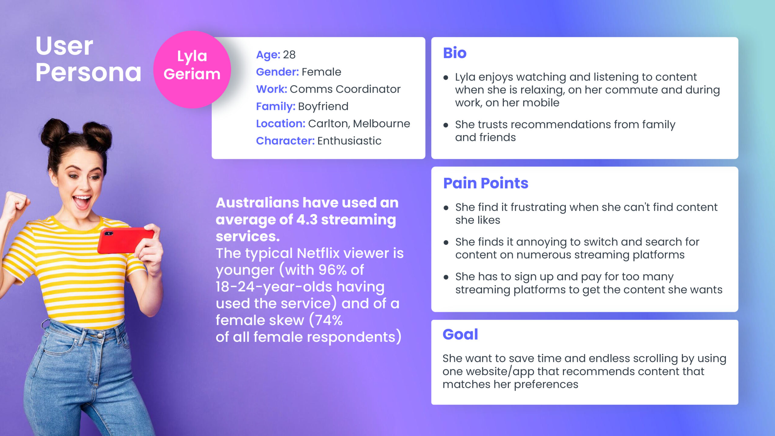
User’s are feeling inundated by the vast quantity of content being offered on streaming services, with conventional filtering and searching parameters that limit their ability to find entertainment they’ll enjoy. This can lead to users feeling frustrated and as though their valuable time spent searching yielded no satisfactory results. As a result, many users are choosing to unsubscribe from streaming platforms, despite having access to a near endless supply of content.
Through unique filtering and recommendations, our platform is able to generate a personalised list of movies, tv shows and other content that users are guaranteed to love.
Research & Analysis
User Testing
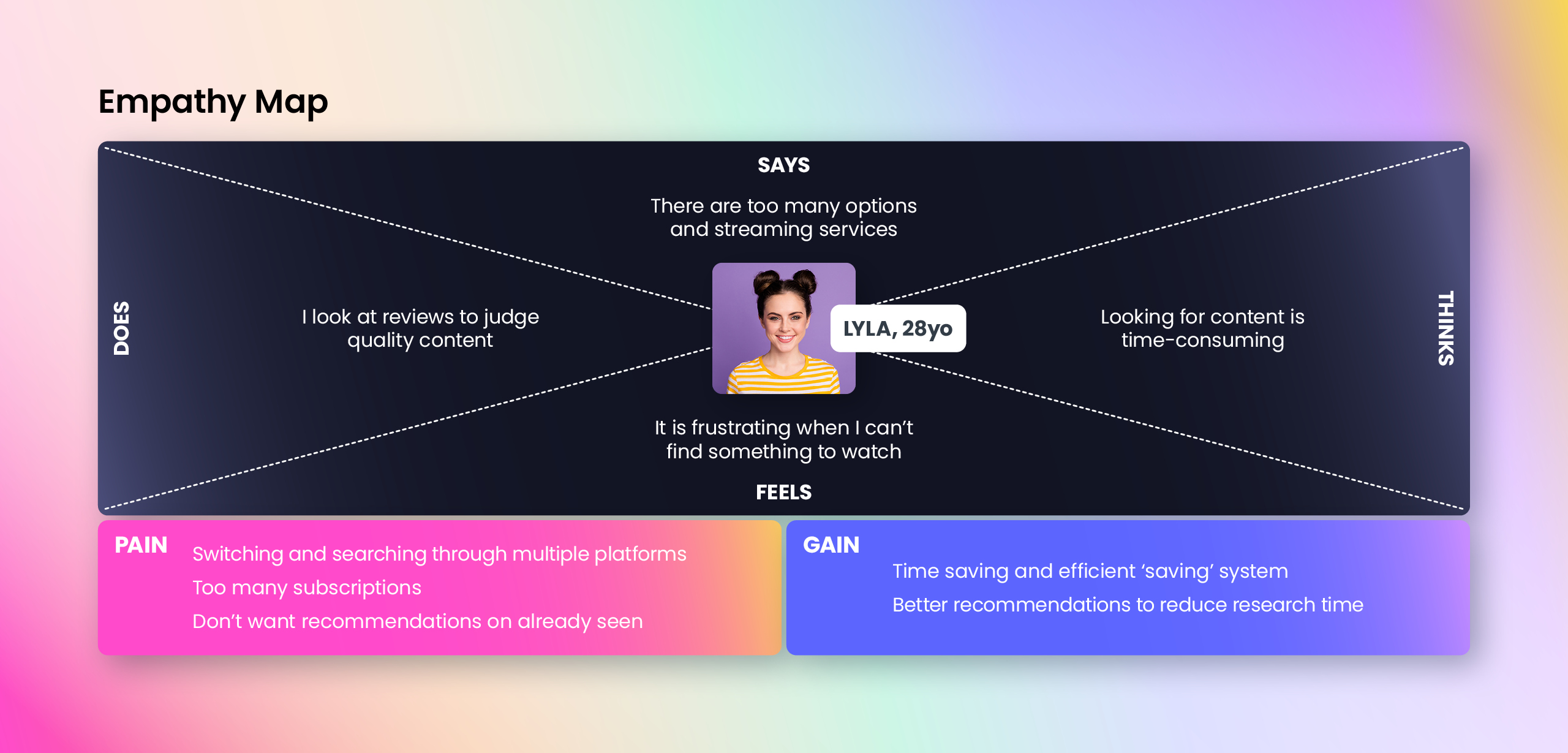
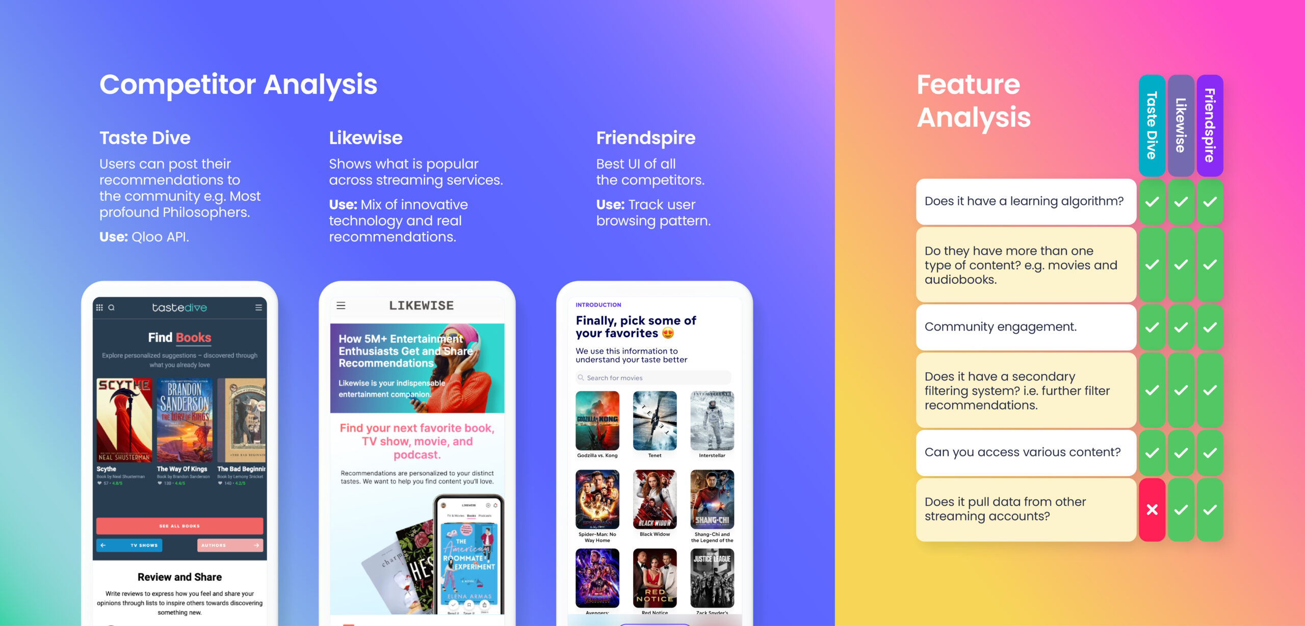
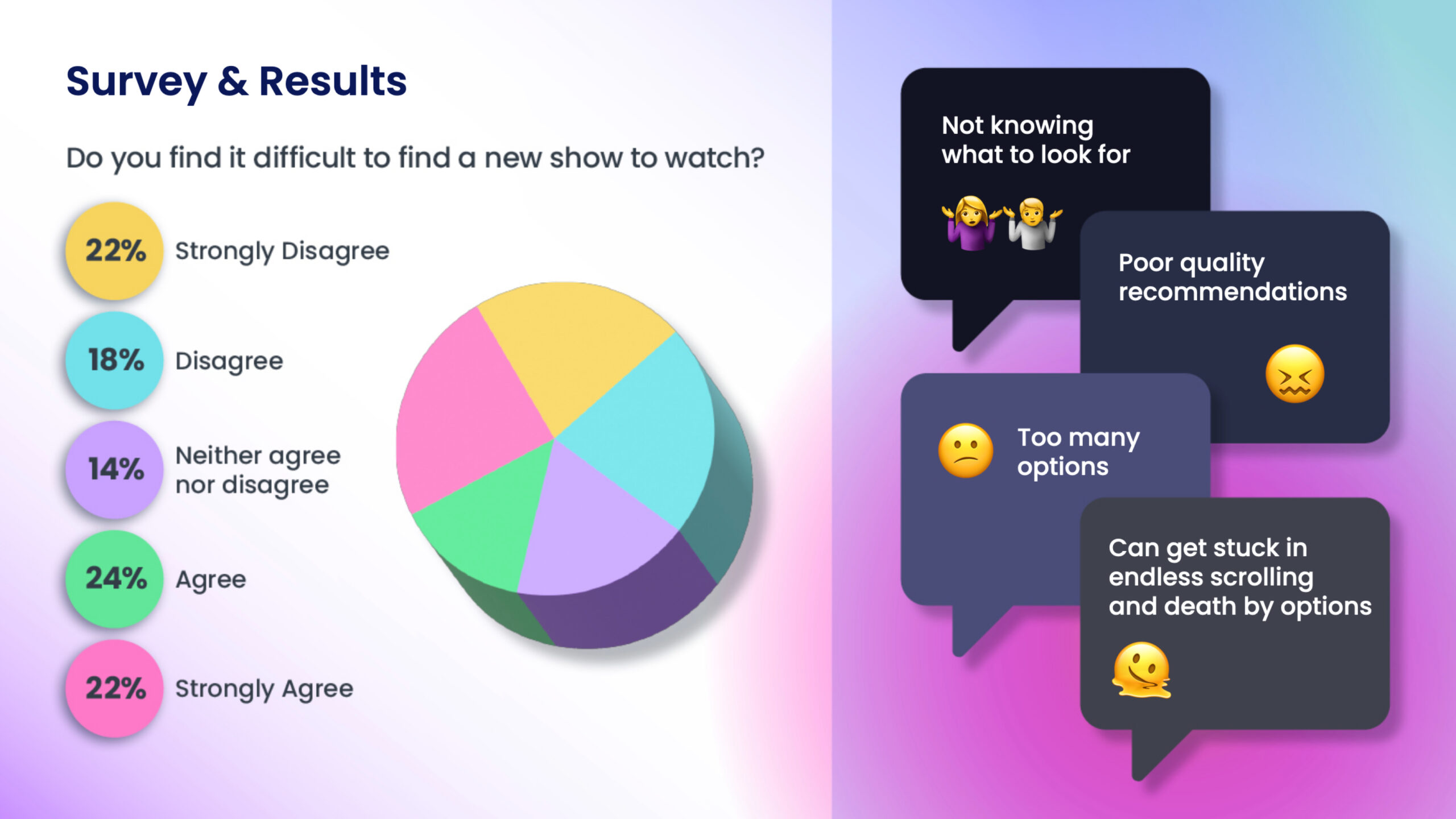
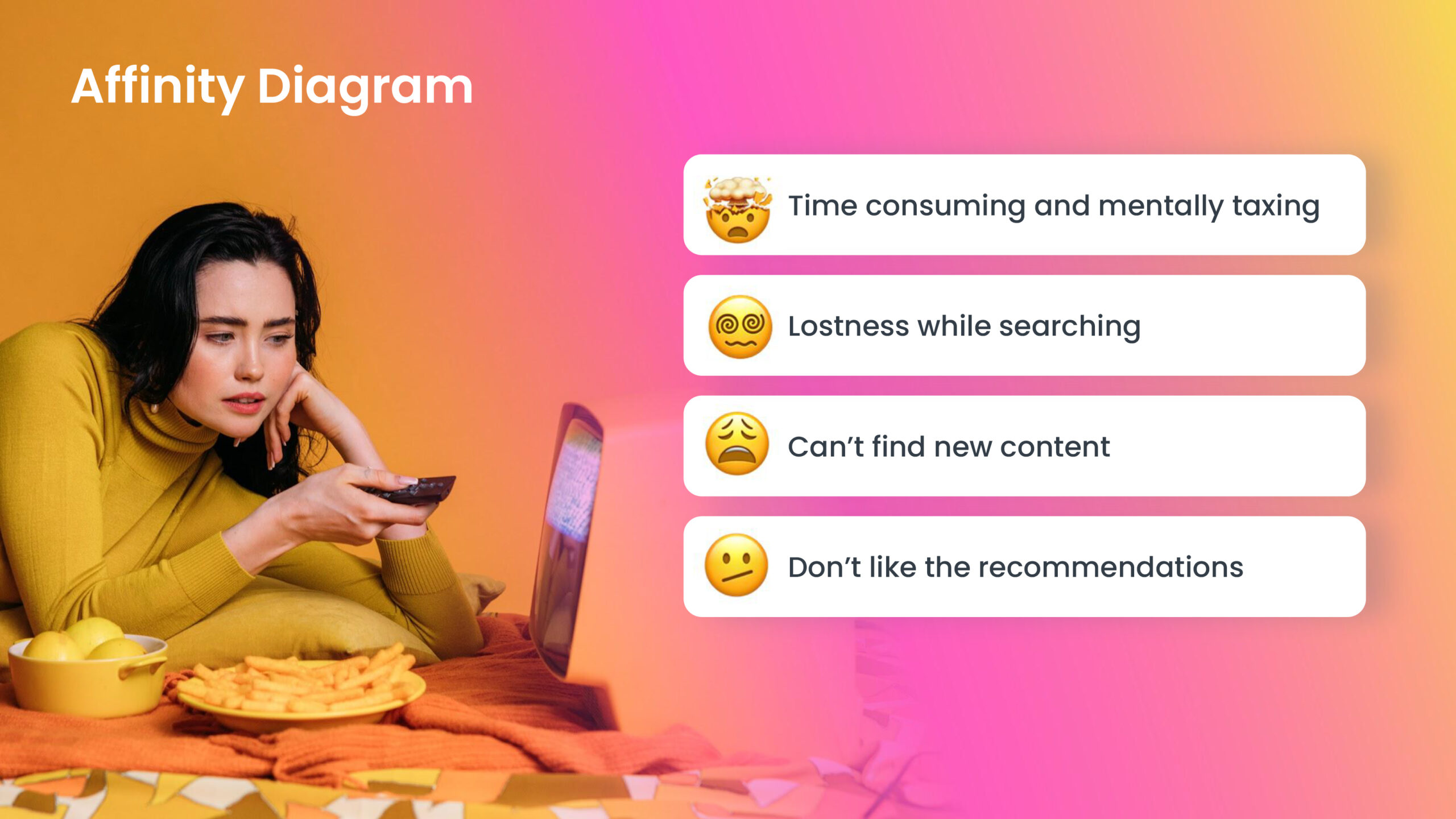
Our research found that users are overwhelmed by the amount of content available and the limited capabilities of streaming services’ in-app recommendation functions and recommendation websites. These sites only offer basic search and filtering results, resulting in a tedious cycle of searching for users to find the content they like.
Wireframes & Prototype
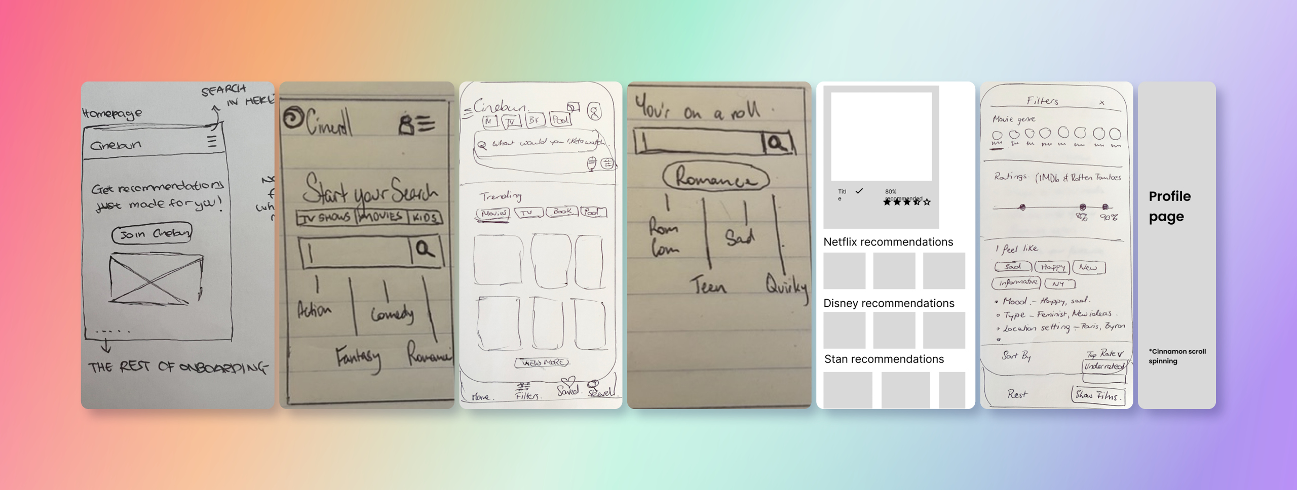
Sketched Wireframes
Each team member created wireframes to capture their ideas. Together, we narrowed down the best features to the unified flow you see here.
Prototype
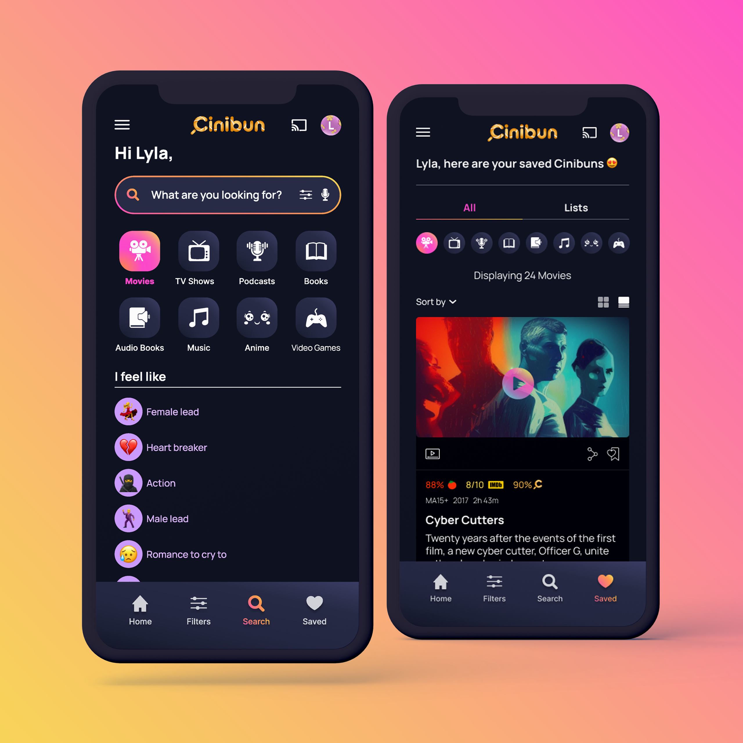
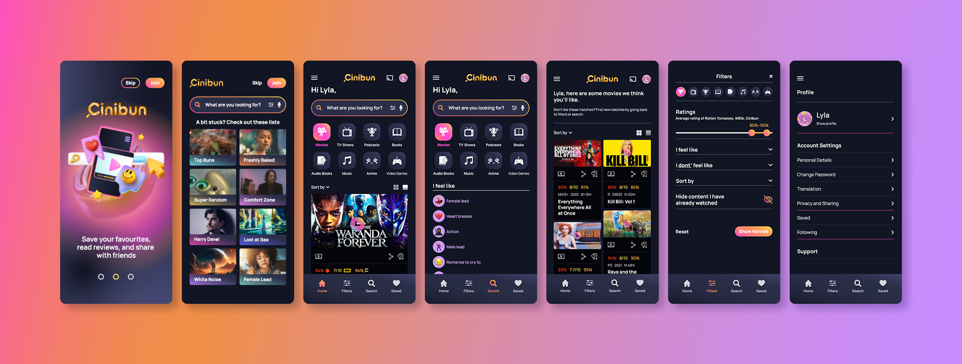
Referring to the sketches, I designed a prototype encapsulating our project’s objectives. The design, which features vibrant colour highlights, soft rounded corners, and a dark mode option for low-light conditions, was geared towards enhancing user engagement and simplifying content discovery. The layout’s user-friendly and enjoyable nature ensures seamless navigation.
User Testing – Prototype
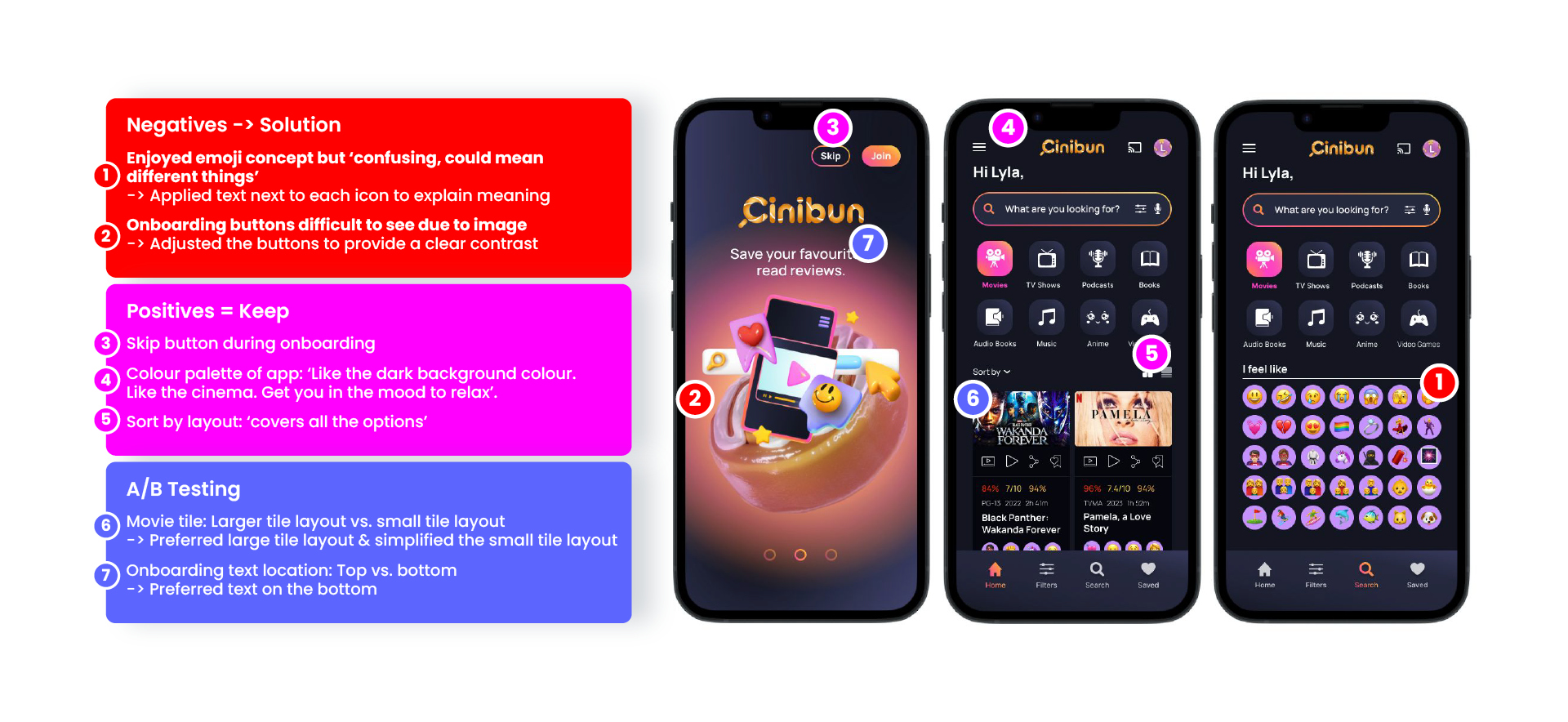
After conducting user testing, Kim and Sarah determined that the usability and design of the app could be improved by adding descriptive text next to the emojis.
The overall response from users was positive, with people commending the design of the app as “on theme,” “fun,” and “easy.”
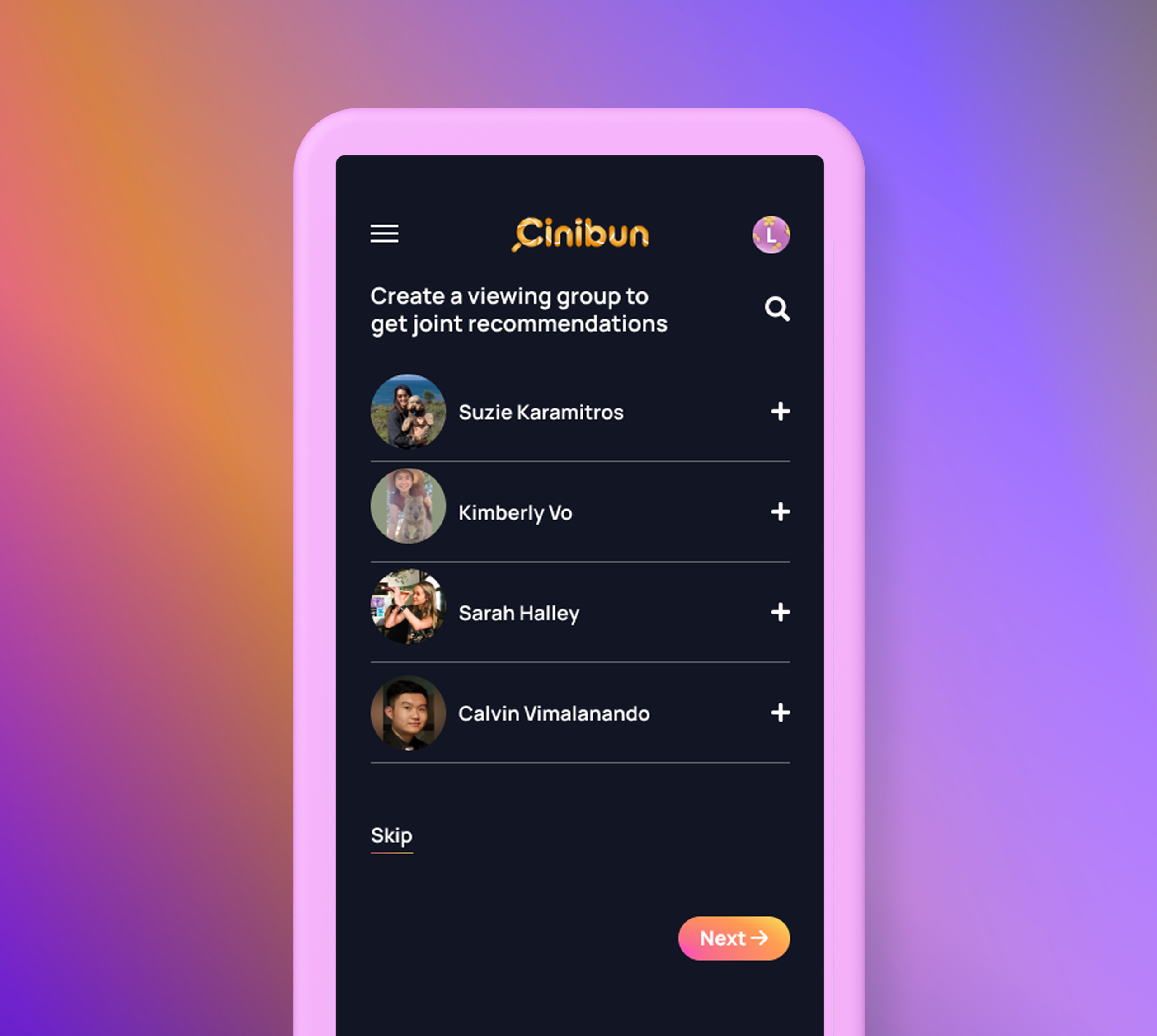
The Cinibun website design makes it easier for users to find the content they like. The features offer more advanced search and filtering options, such as I don’t feel like, sort by following friends & family, and hide content I have already watched. Cinibun ceates personalised recommendations to generate content tailored to users’ tastes and preferences.
The Cinibun website design provides users with an enhanced experience free from the frustration associated with generic search functions. We give users back their valuable time so they can relax, kick-back and enjoy content they love.
