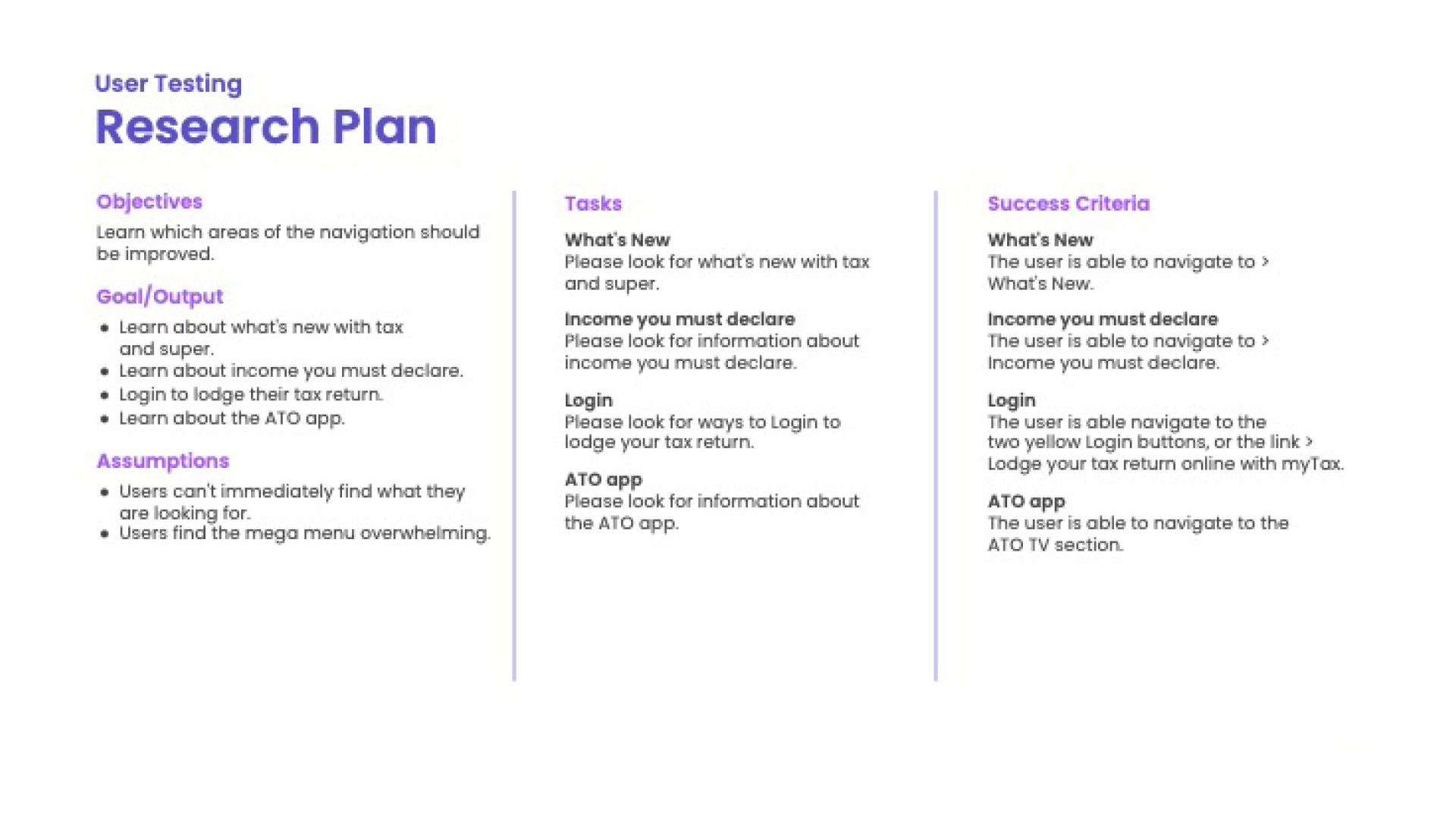
With the aim of providing a better user experience for the Australian Taxation Office (ATO) website, I conducted extensive UX research. During this process, I conducted interviews with users, examined data, and created tests to diagnose any issues with the existing design.
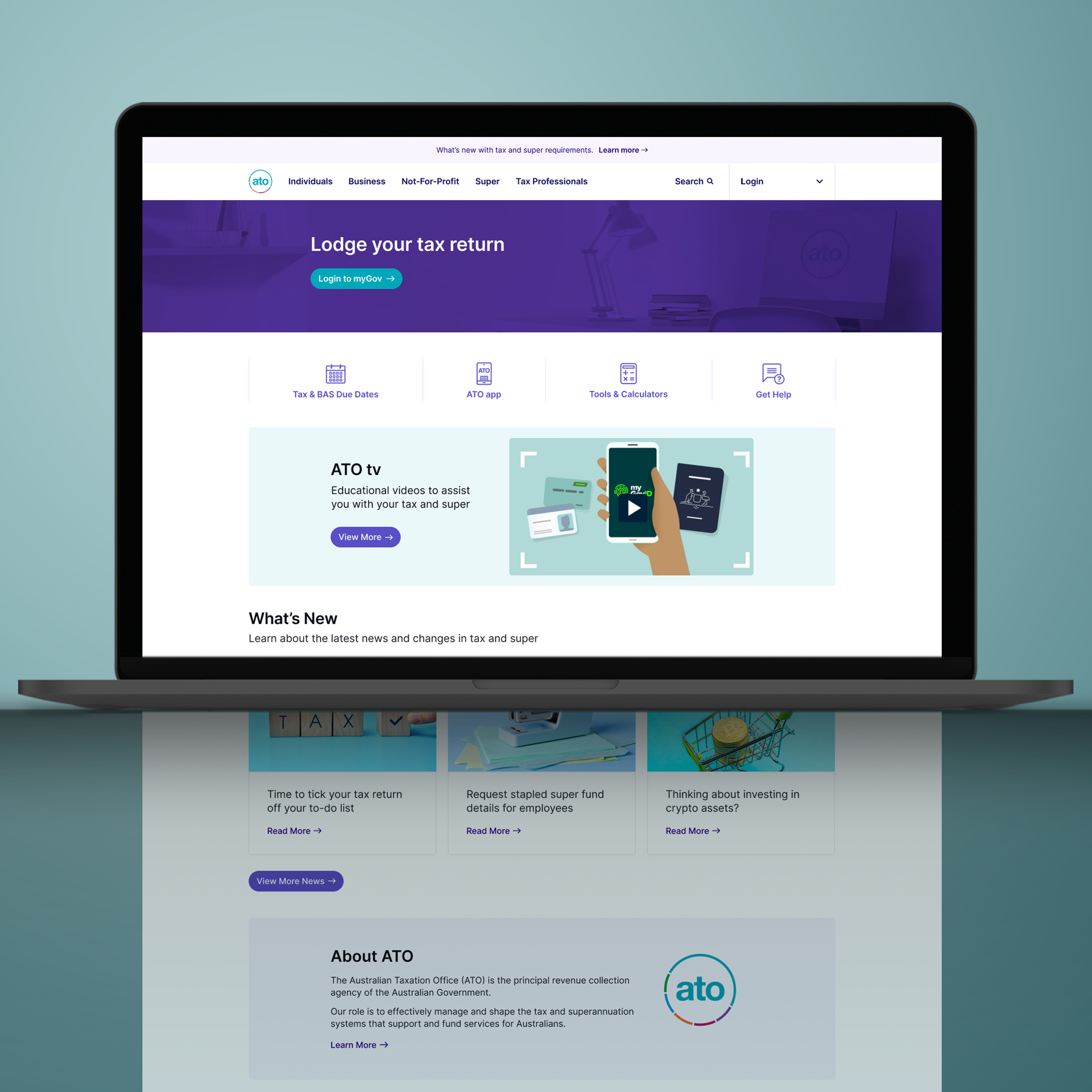
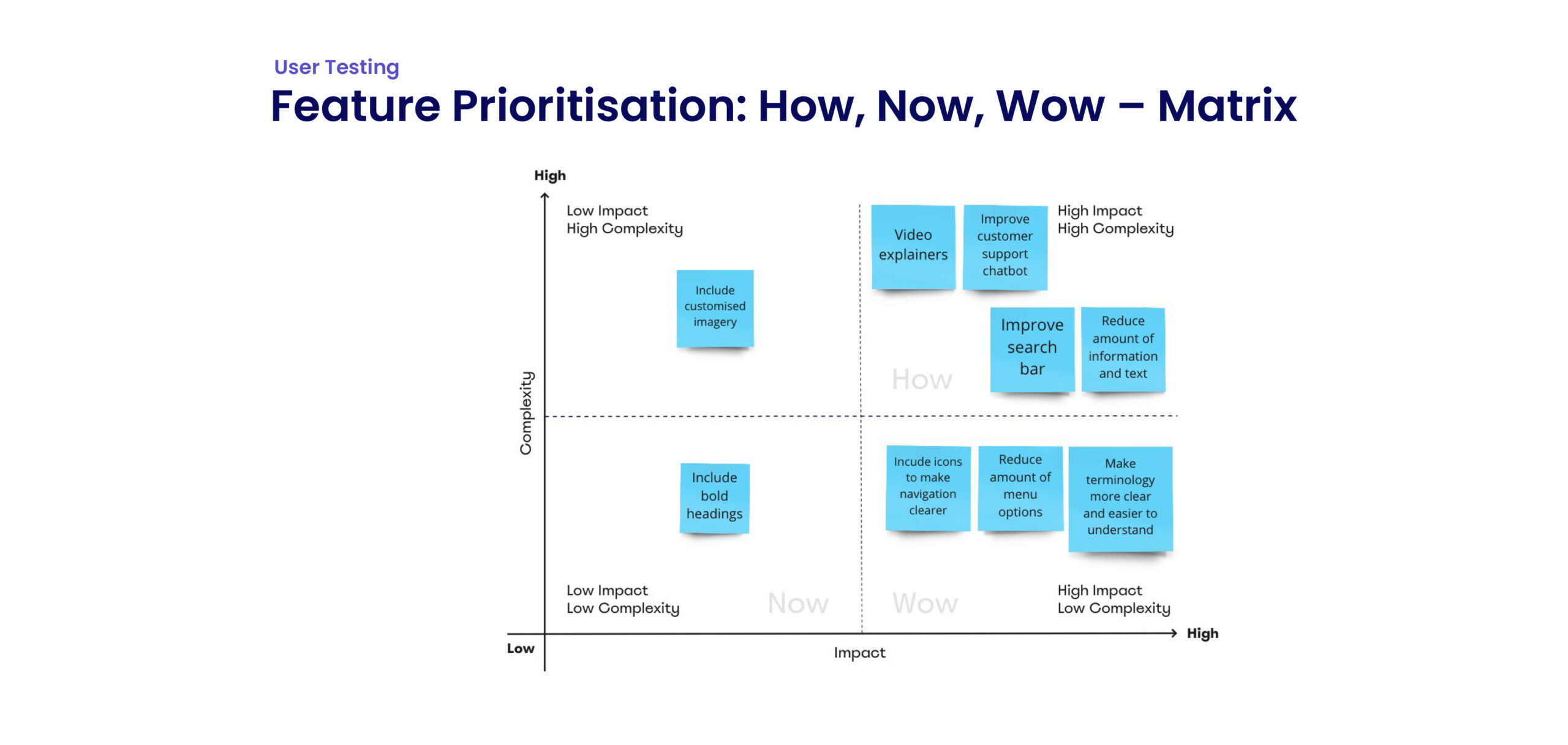
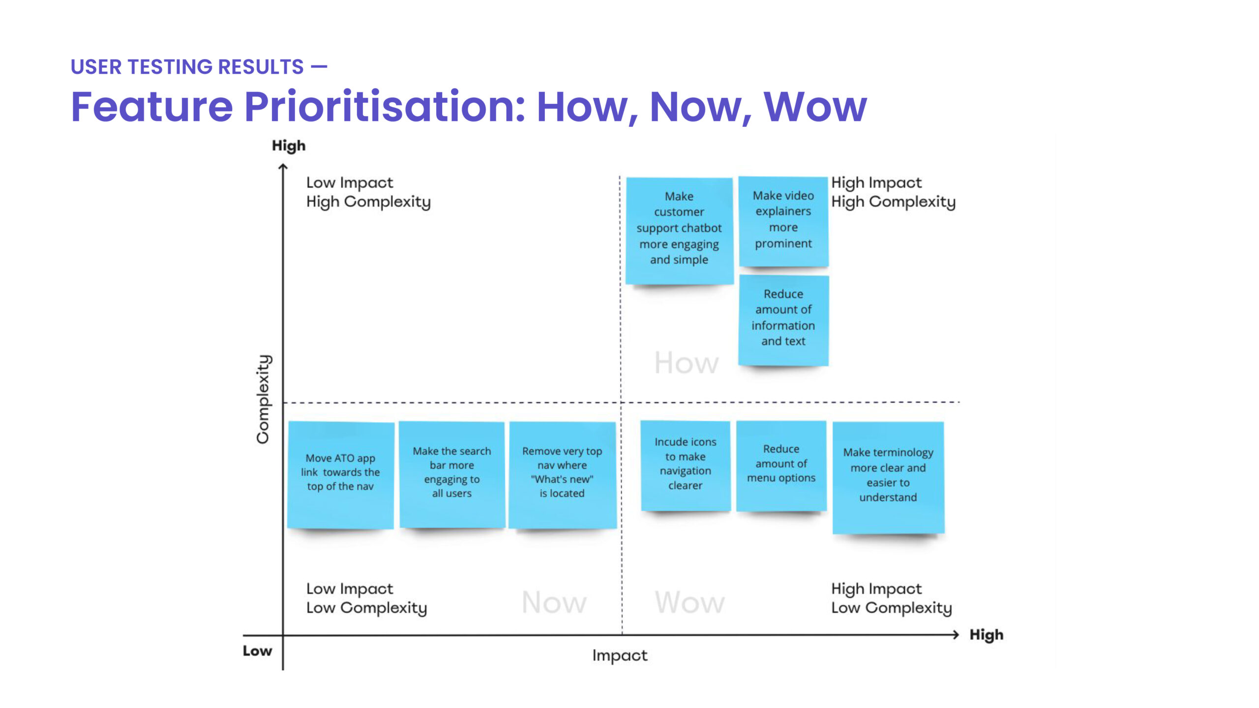
Considering the user’s needs, I redesigned the website to ensure they had all the essential information necessary for completing their tax tasks. To this end, I emphasised the video explainers by increasing their visibility and making them more accessible. I also streamlined the amount of information and menu options while ensuring that users had all of the information they needed. The outcome was redesigning the website, creating a positive user experience that would help reduce confusion and overwhelm.
Research & Analysis
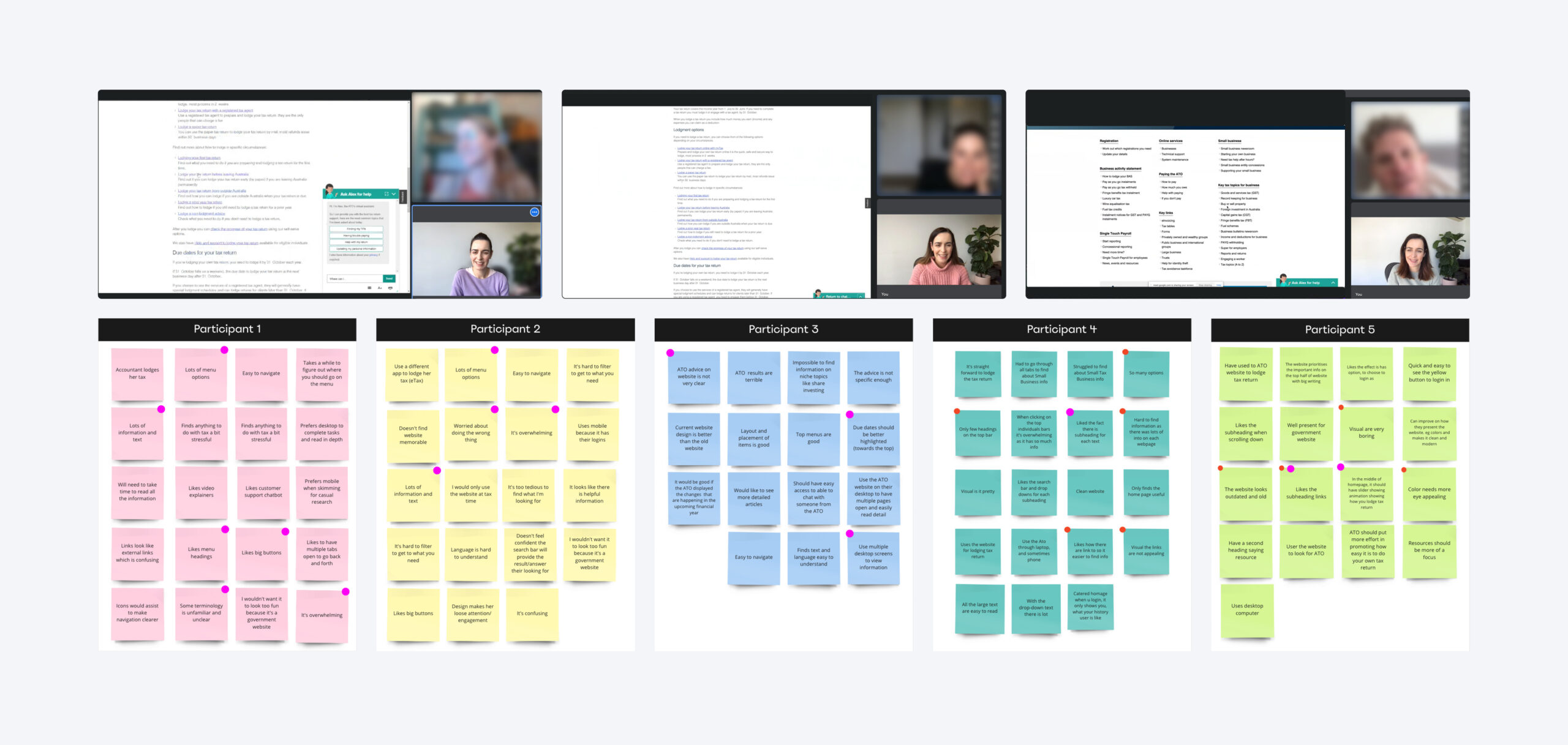
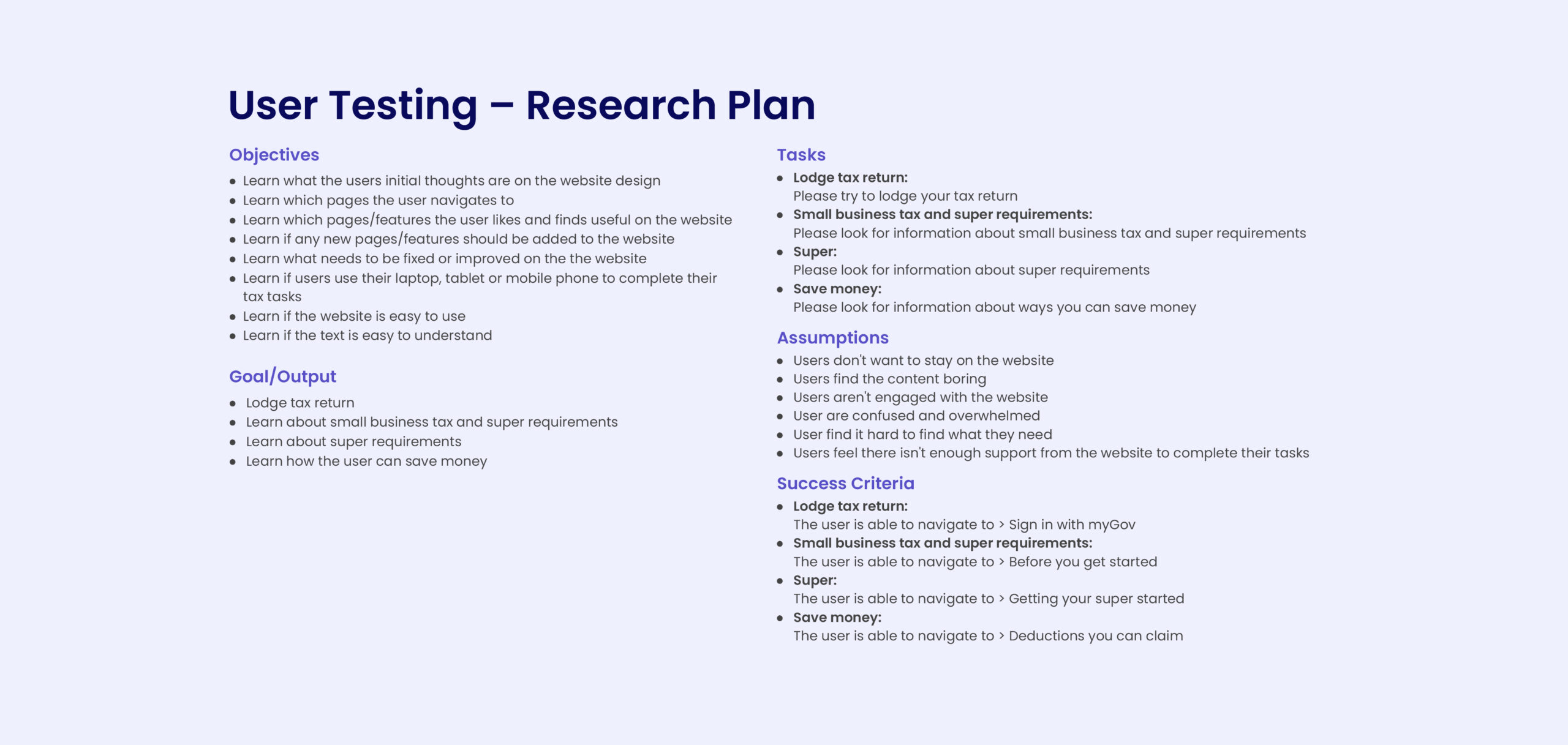
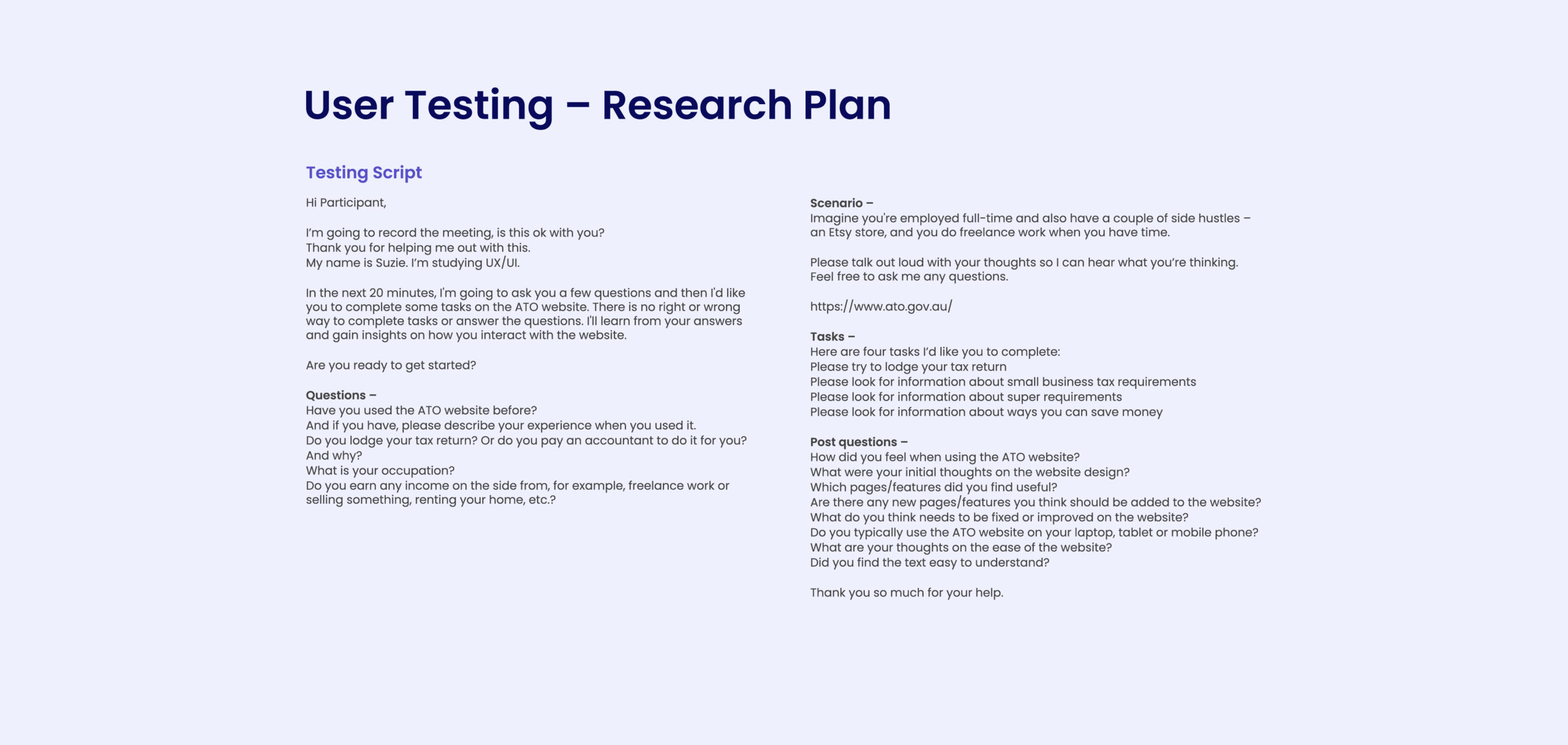
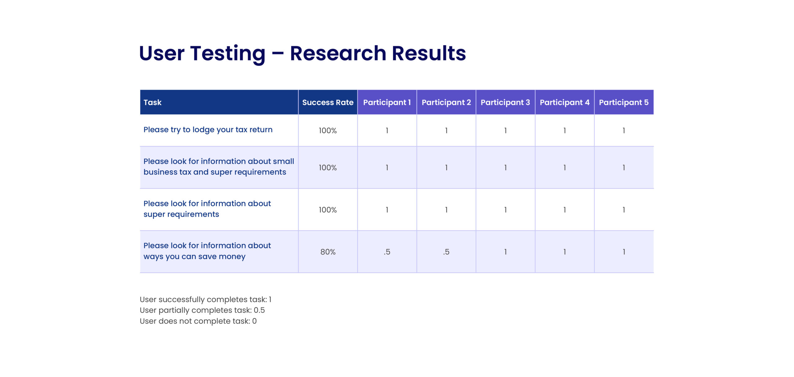
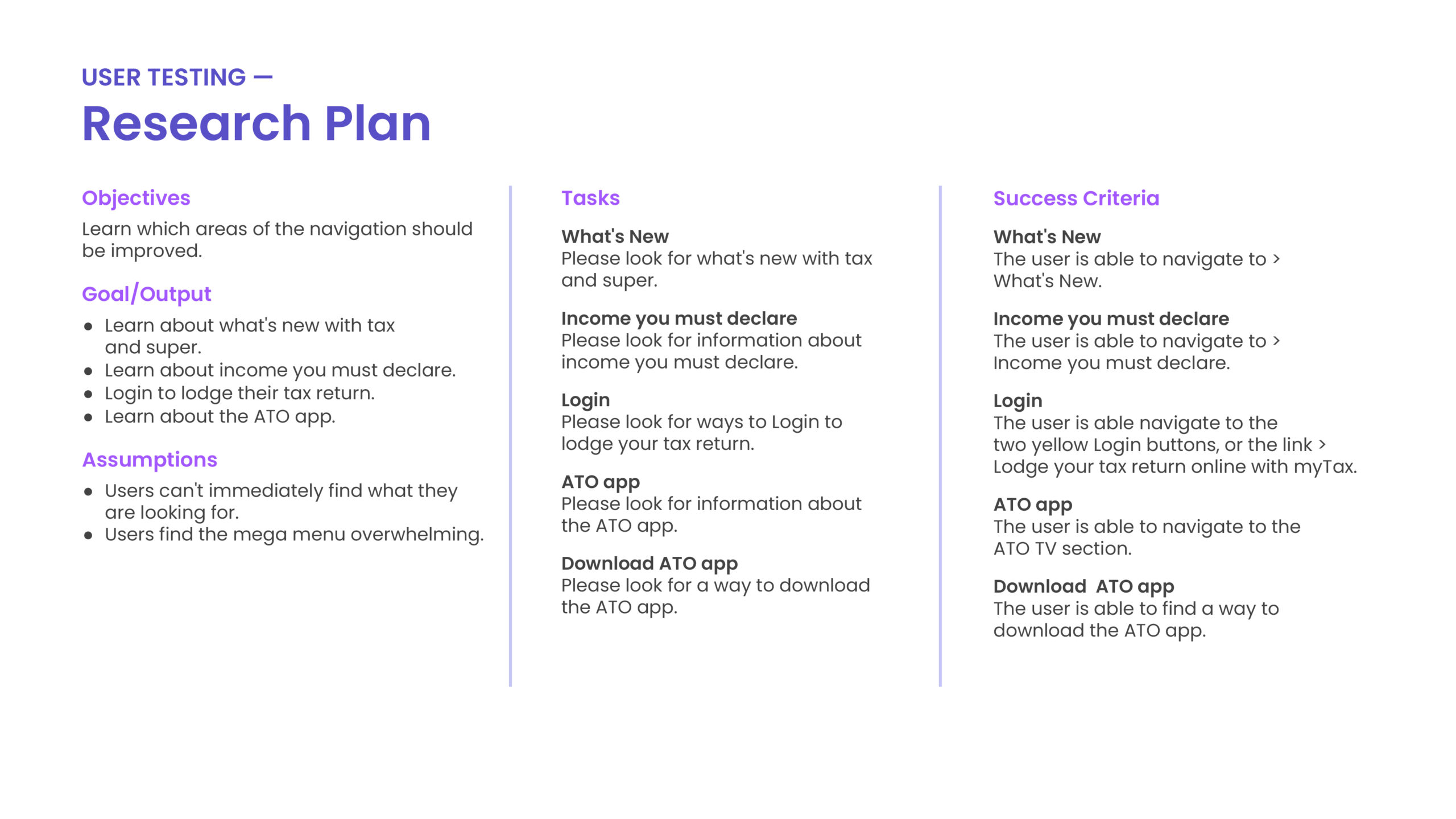
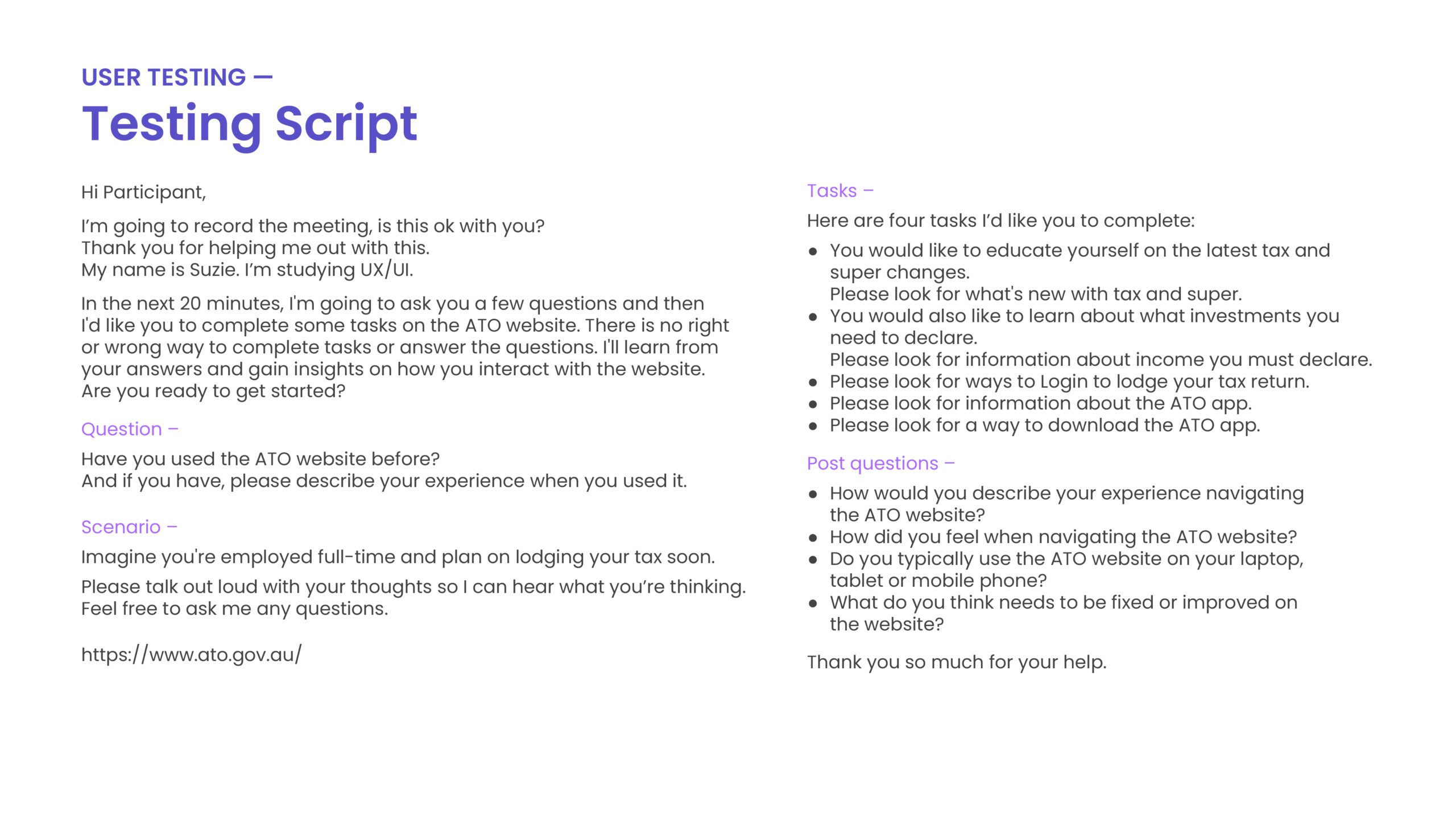
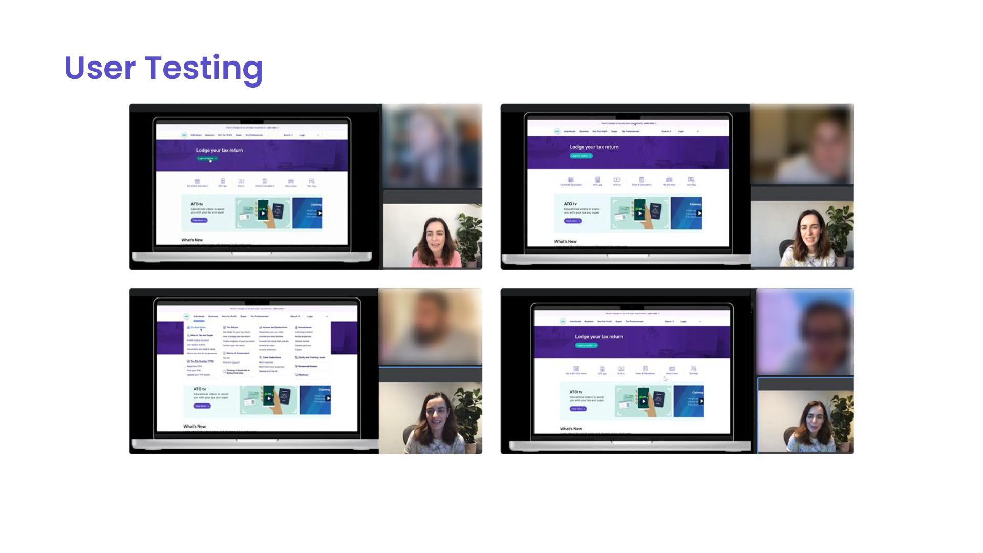
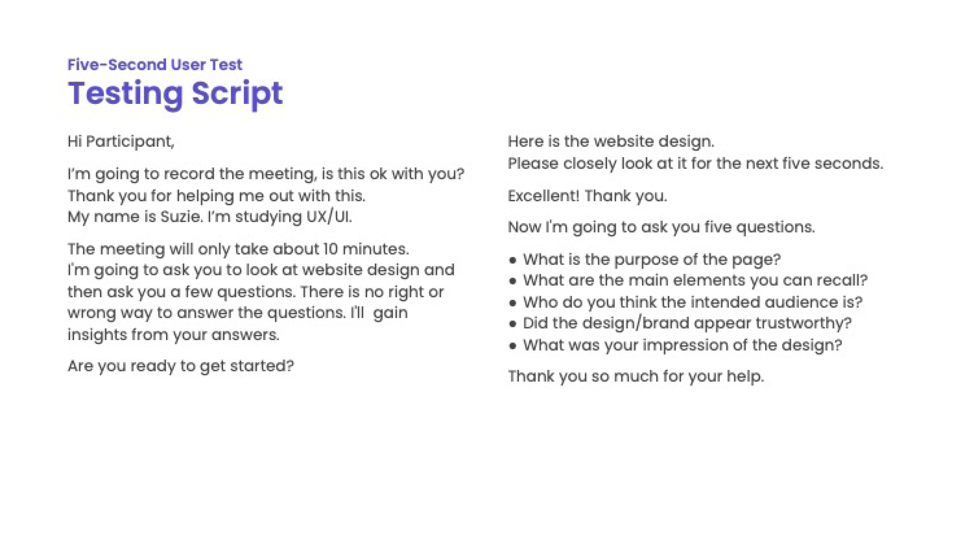
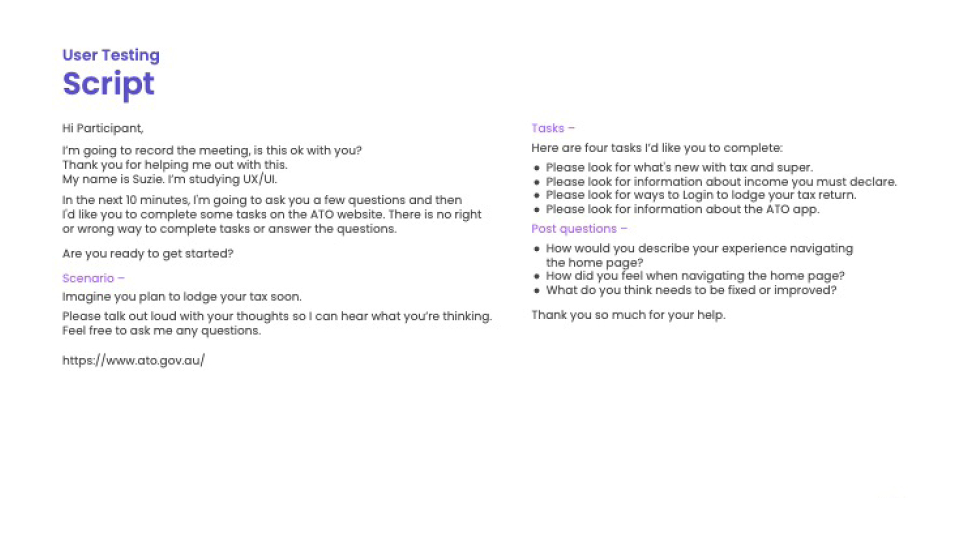
User Testing –
Home Page
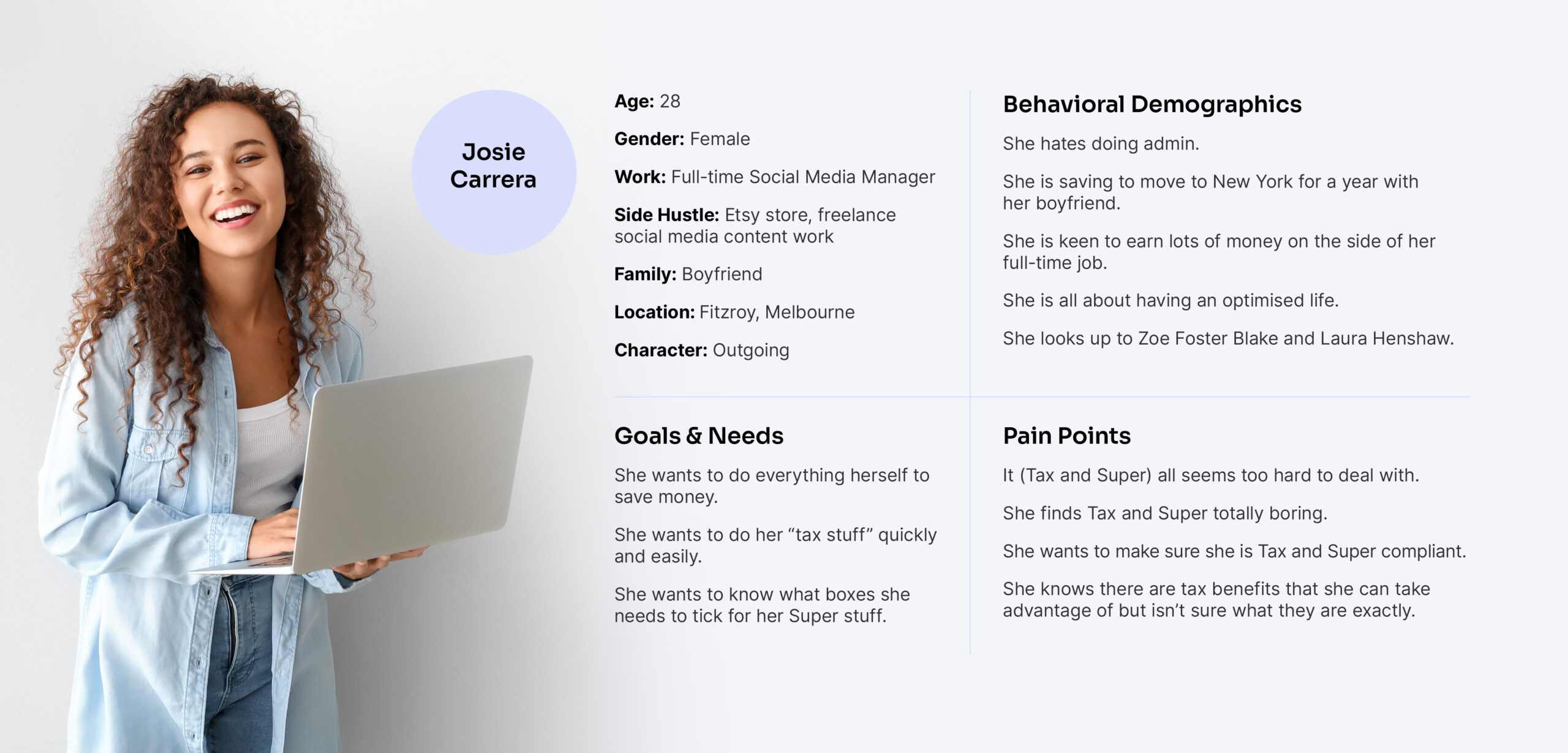
After interviewing users, the resounding feedback was that navigating the website can be an overwhelming and stressful experience, with too many menu options and too much information presented at once. They also expressed that the “tax” language was hard to understand.
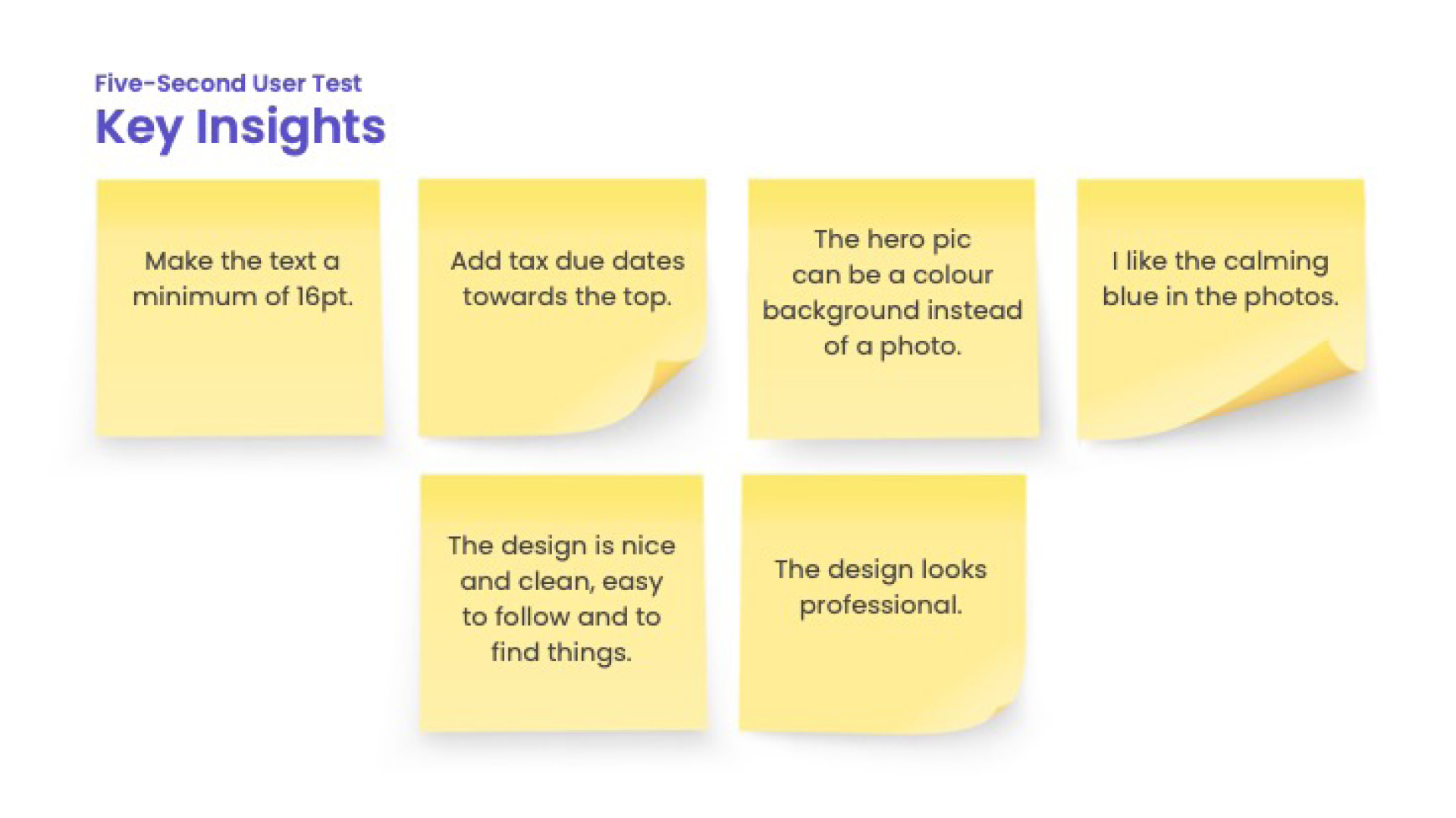
Users liked the big buttons and wanted to see more video explainers. They liked that the existing design looked trustworthy and professional but also found it dull.
It's stressful/scared to do anything wrong
Language is hard to understand
Likes big buttons
Too many menu options
Should have video explainers
Too much information
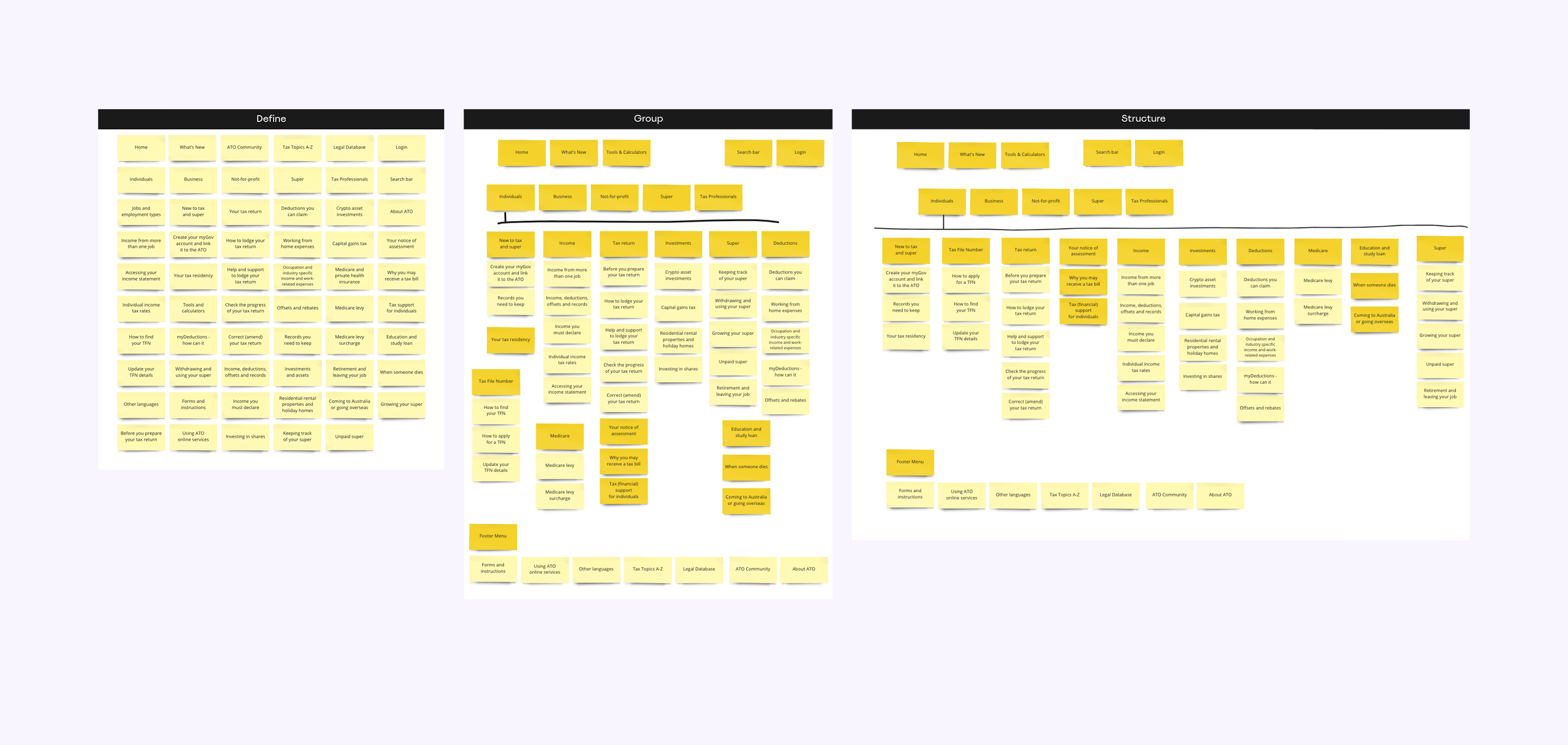
Information Architecture
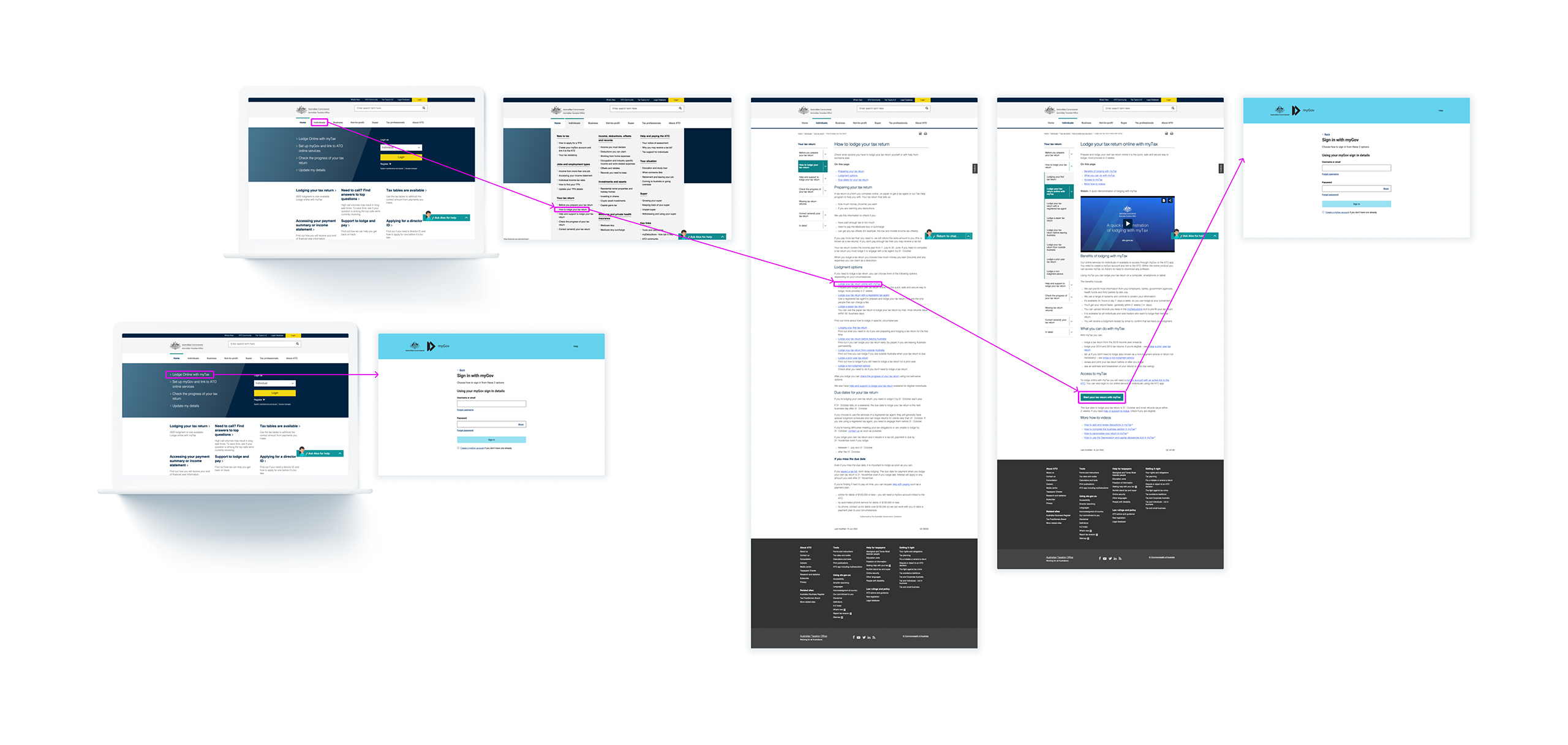
Typical User Paths
Card Sorting
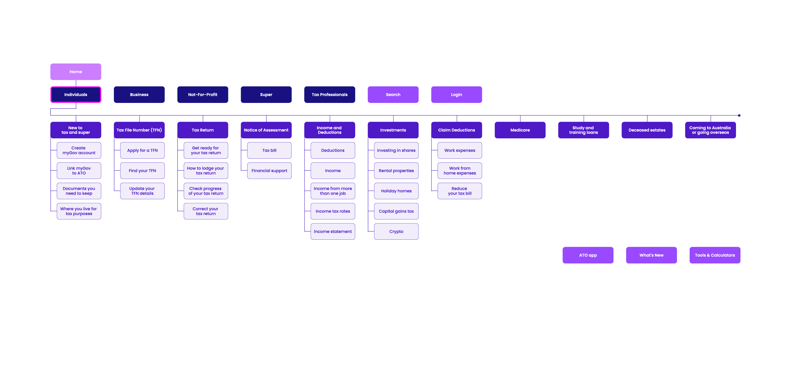
Sitemap
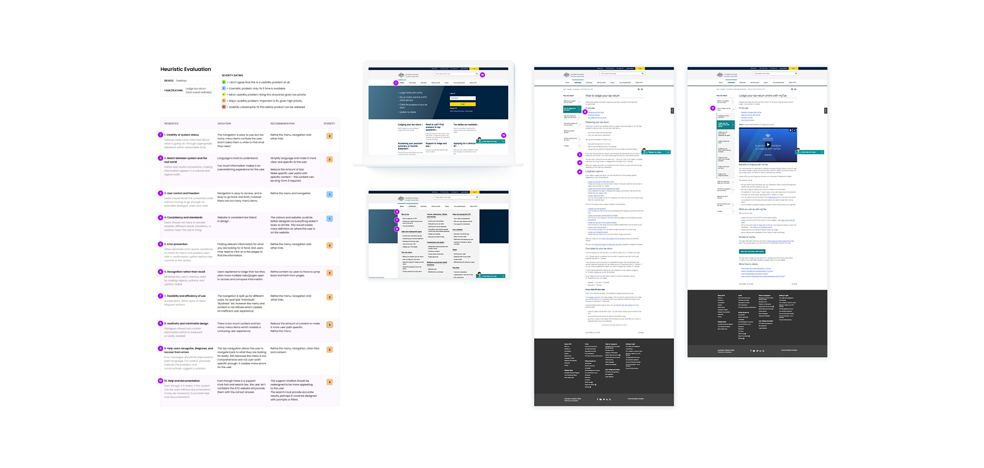
Heuristic Evaluation
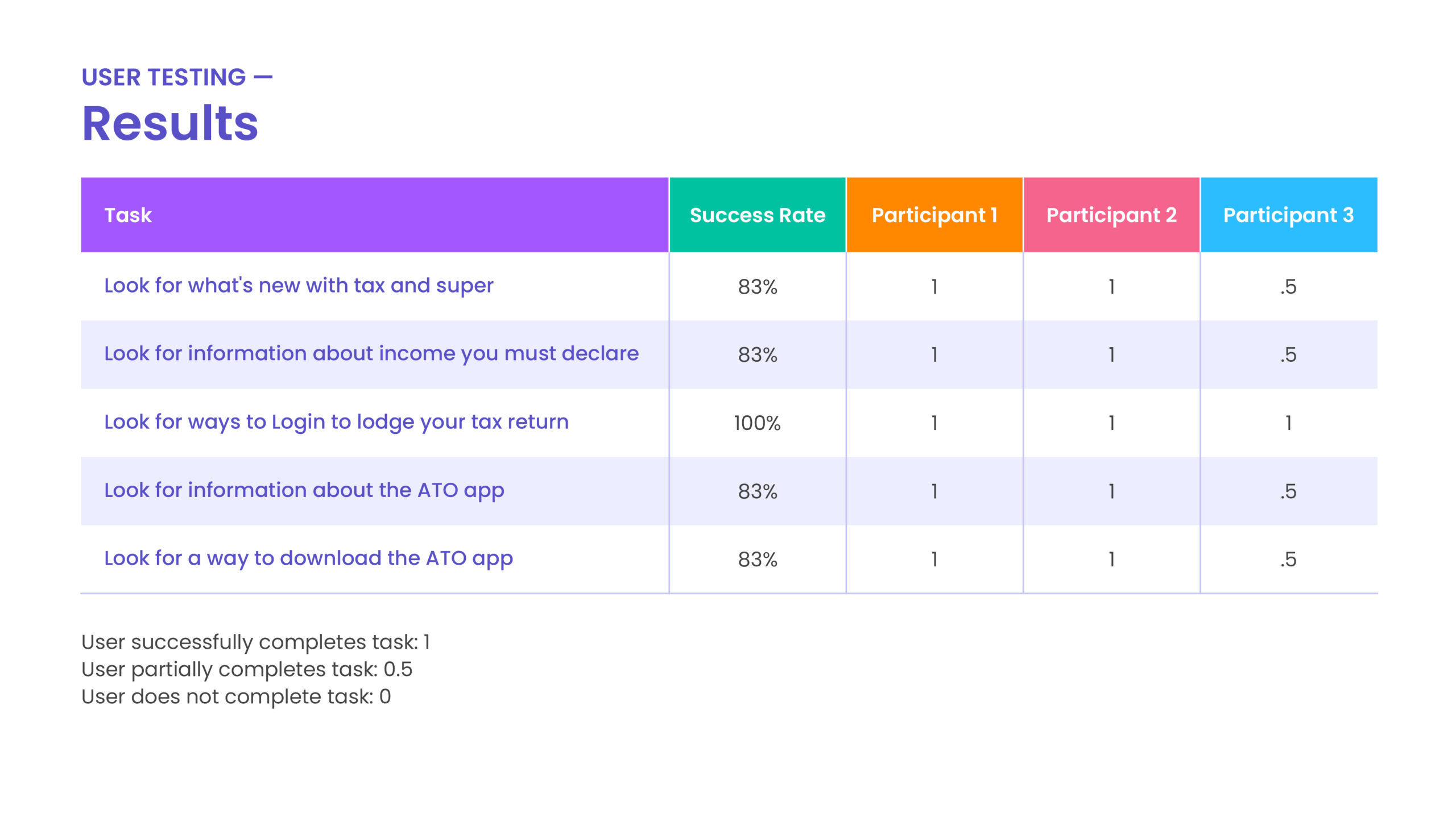
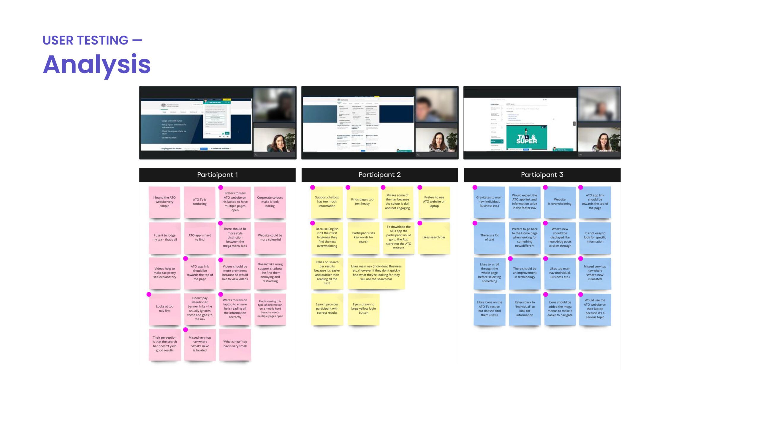
User Testing – Navigation
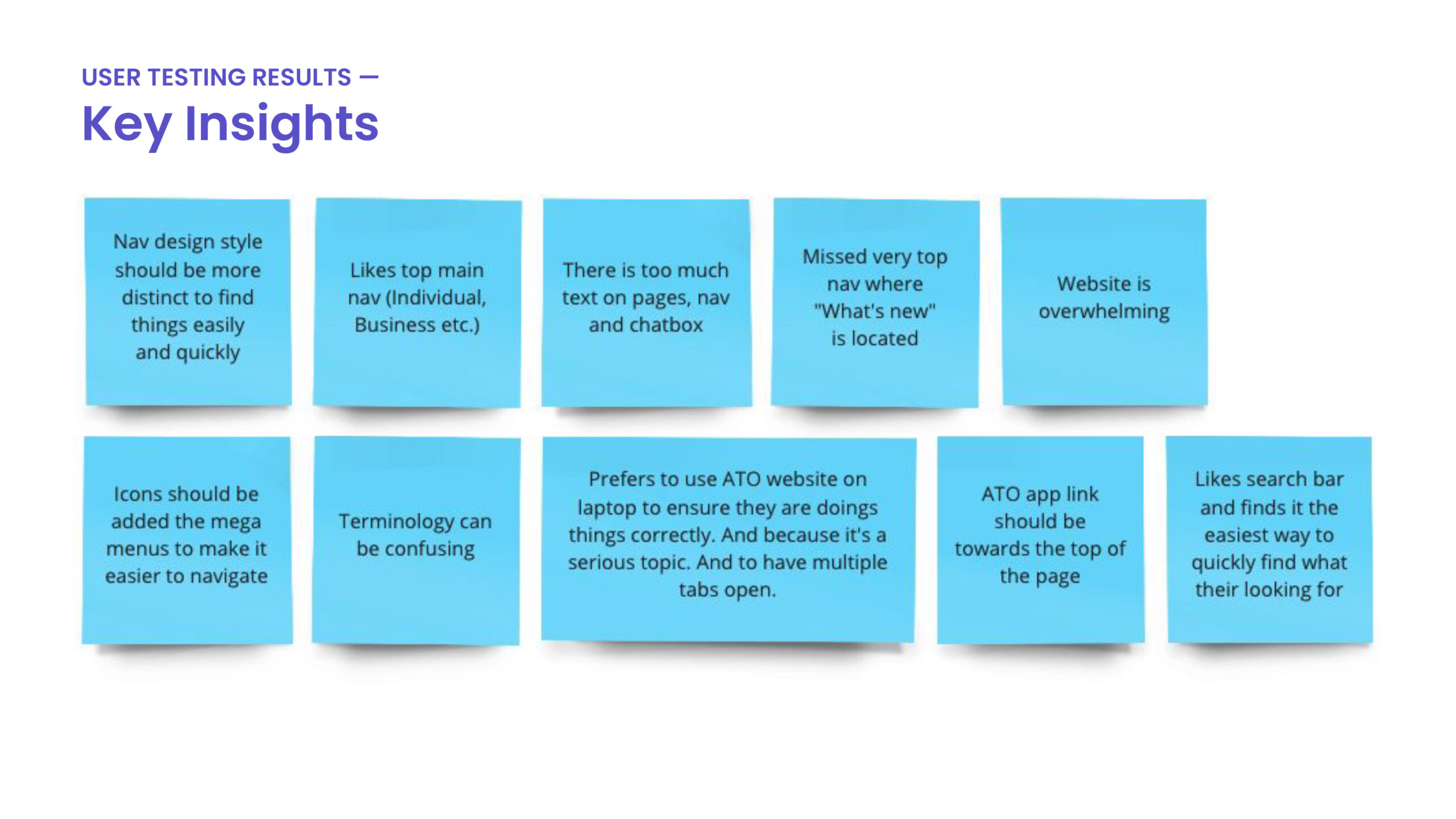
Users said the navigation should be more distinctive by adding more visual cues, such as icons, bold fonts or different colours, to enable users to pinpoint their desired content more easily. Additionally, there needs to be less text in each menu section. Users prefer using the ATO website on their laptops rather than mobile to shuffle between multiple tabs/pages easily.
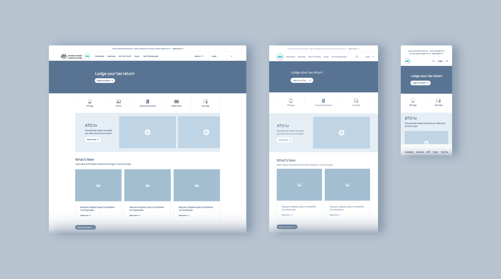
Wireframes & Prototype
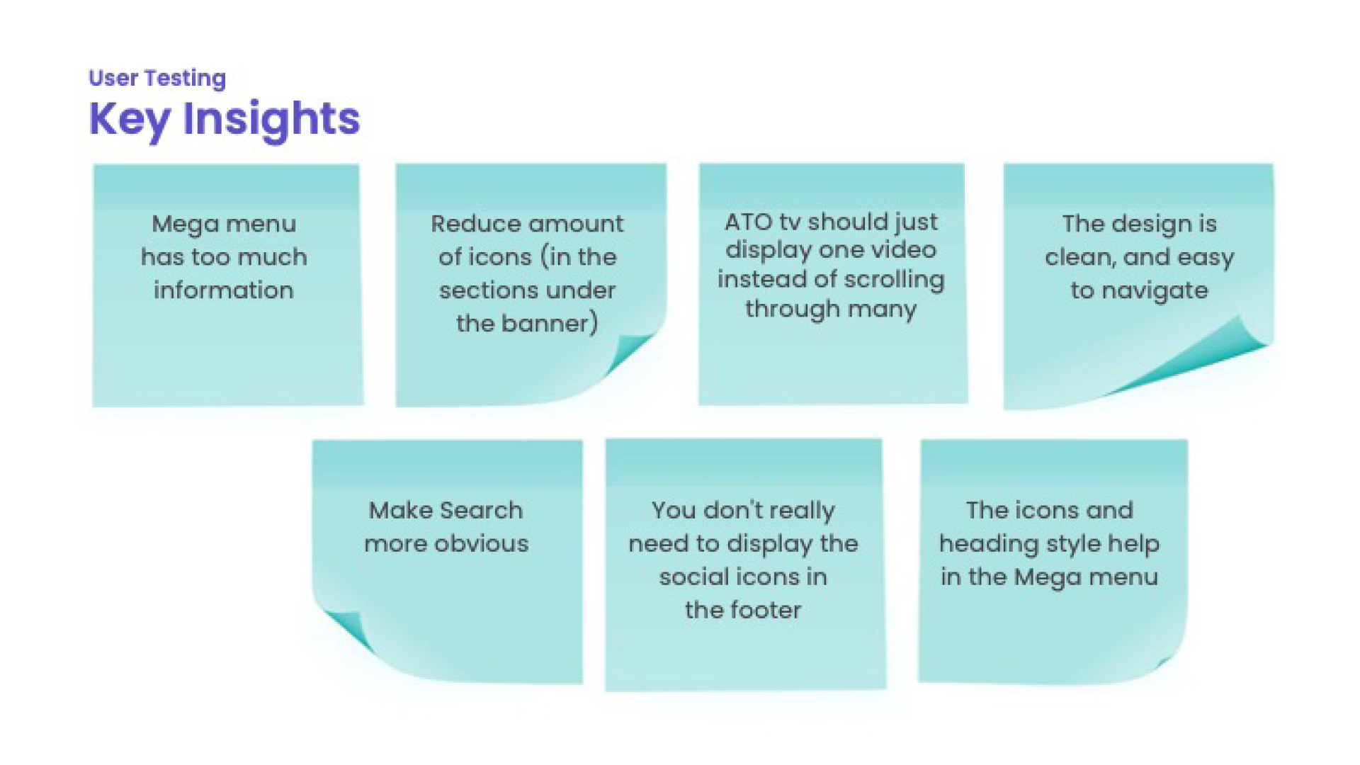
User Testing – Prototype
Key Insights
Mega menu has too much information
The icons and heading style help in the mega menu
Reduce amount of icons (in the sections under the banner)
The design is clean, and easy to navigate
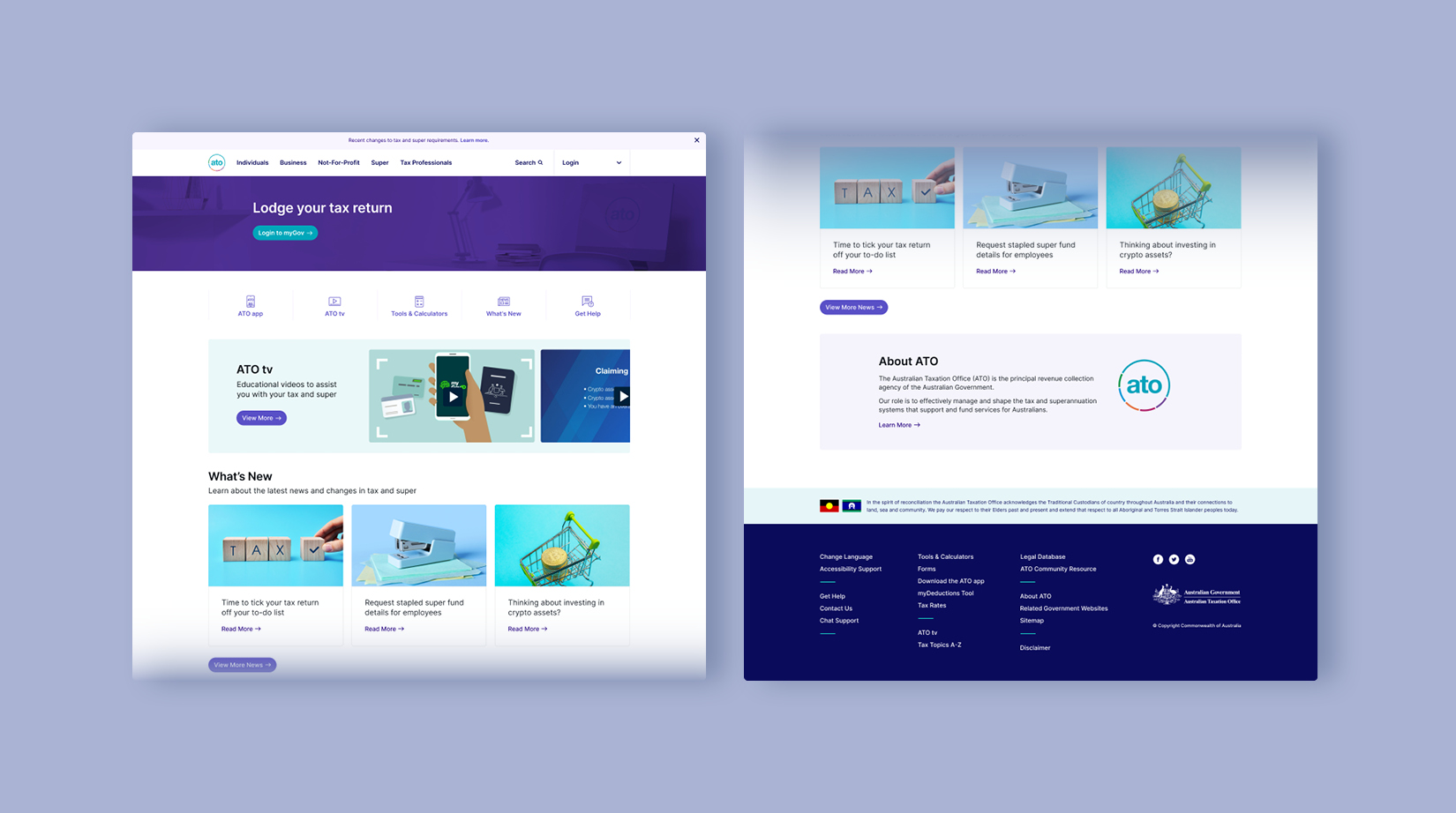
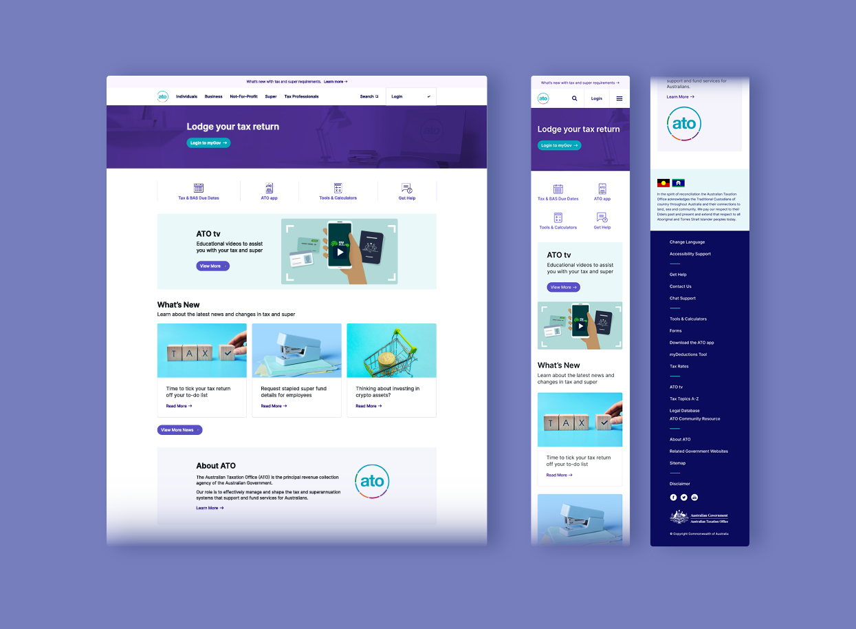
Iterated Prototype
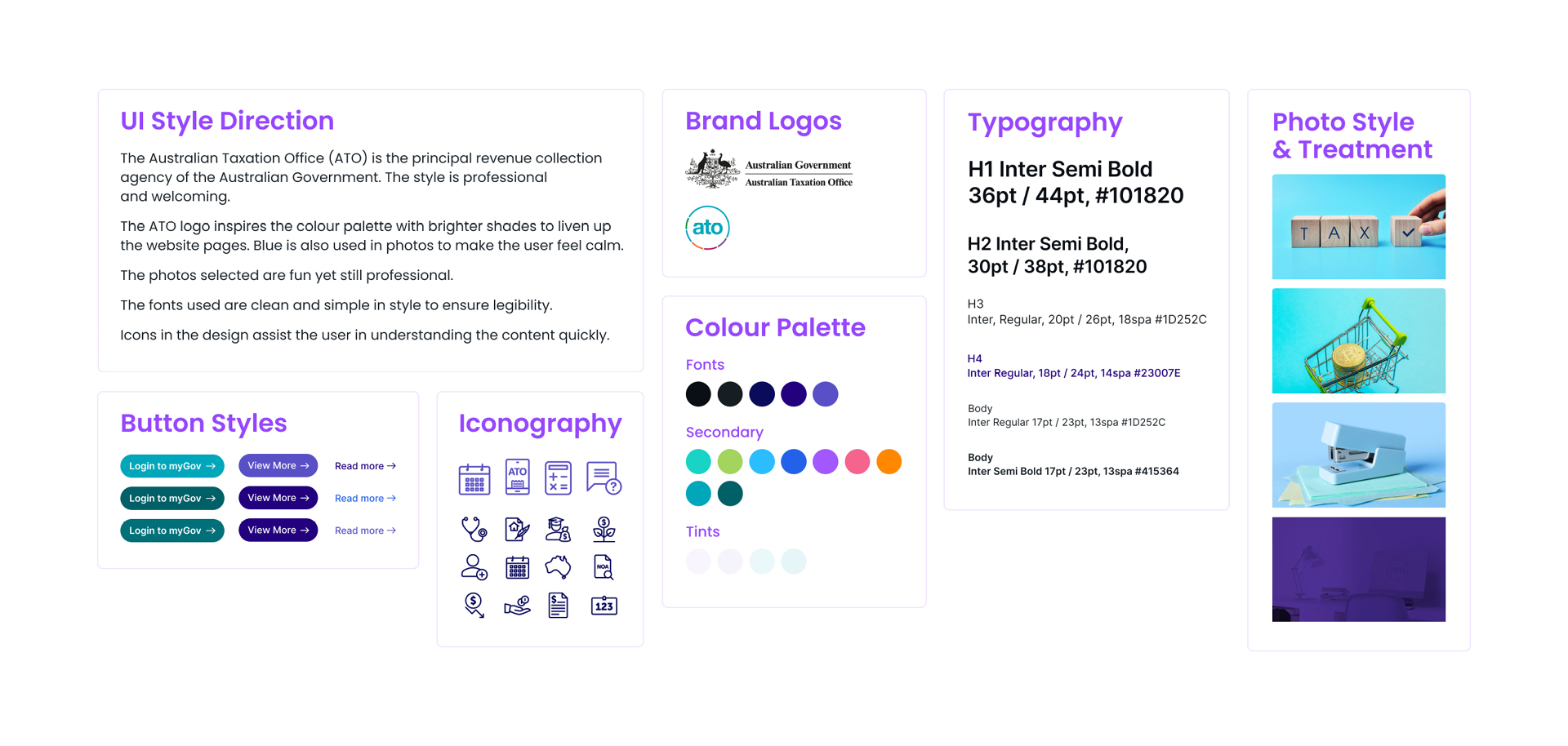
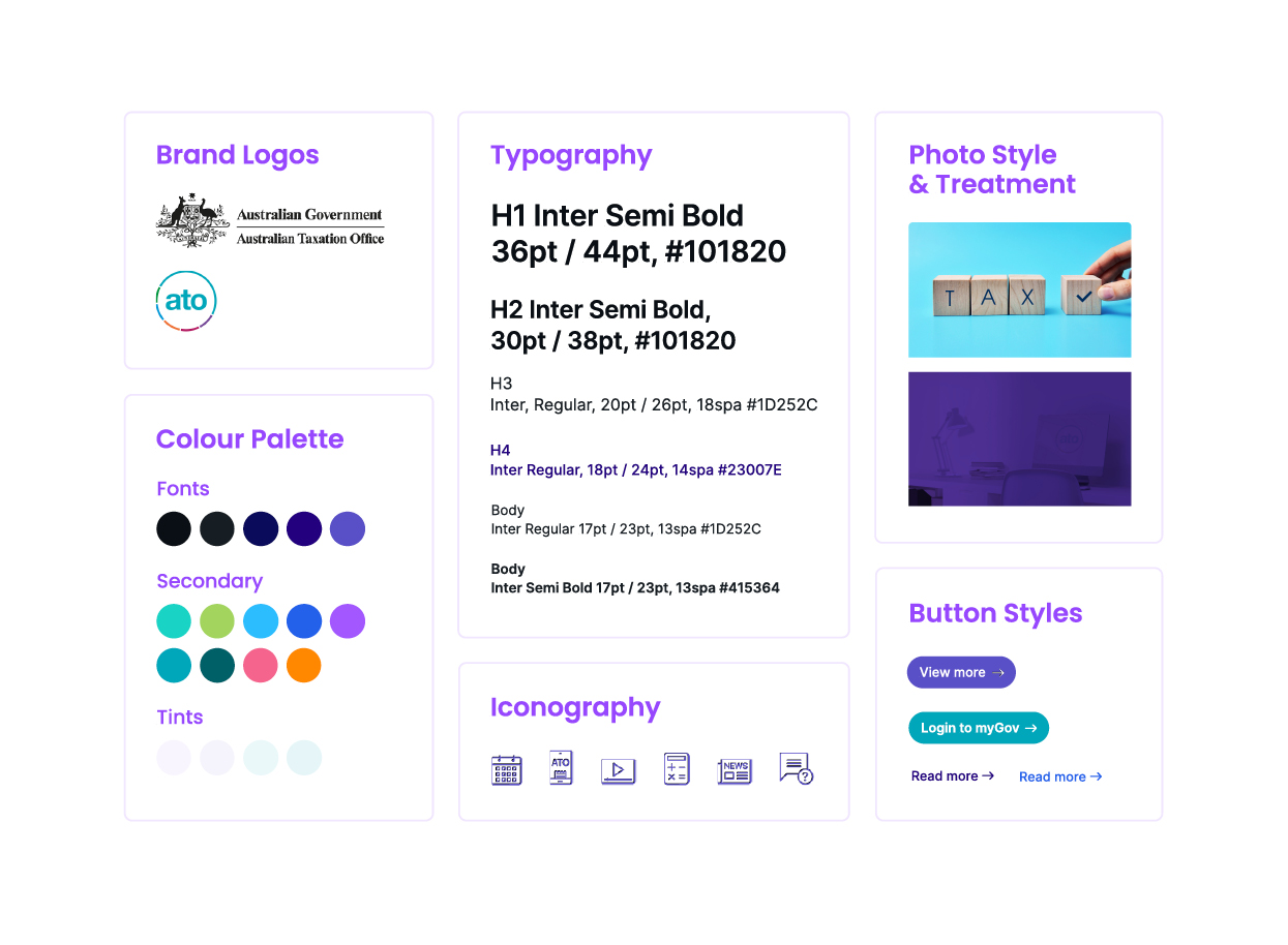
User Interface Style
The vibrant colours and tones of navy add a sense of trust and comfort. The photos used are are both fun and professional. The text is formatted in a way that allows the user to absorb information quickly. Furthermore, icons assist the user in understanding the content quickly.
The overall design is intuitive and inviting, creating a positive user experience that eliminates confusion and overwhelm.
To maximise user satisfaction and minimise confusion, the content and functions were carefully selected, organised and displayed in an easily understandable way. Elements were structured to ensure easy navigation and minimise user cognitive load. To further optimise usability, visuals such as icons, videos and images were incorporated to make complex concepts easier to comprehend.